Technical case study
Stock Market Analysis
An exploratory stock-market analysis of normalised prices, daily returns, correlations and volatility across multiple equities and the S&P 500.
The problem
This project analyzed historical stock price data for major companies and the S&P 500 index to understand price movements, correlations, and daily return patterns. I built an interactive dashboard using Python’s data science stack to visualize both raw and normalized stock performance alongside risk metrics.
What changes when stock performance is compared through normalised prices and daily returns rather than raw price levels?
Approach
Rather than presenting the project as a notebook dump, this case study focuses on the decisions that shaped the analysis.
- Explore data: Loaded stock price data using pd.read_csv() and explored the dataset structure with .info() , .describe() , and .head() to understand the time series format and identify key stocks. Checked for missing values using .isnull().sum() and calculated basic statistics like mean returns and standard deviation to assess data completeness and variability.
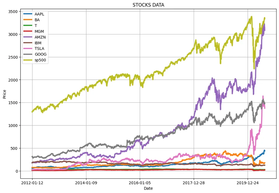
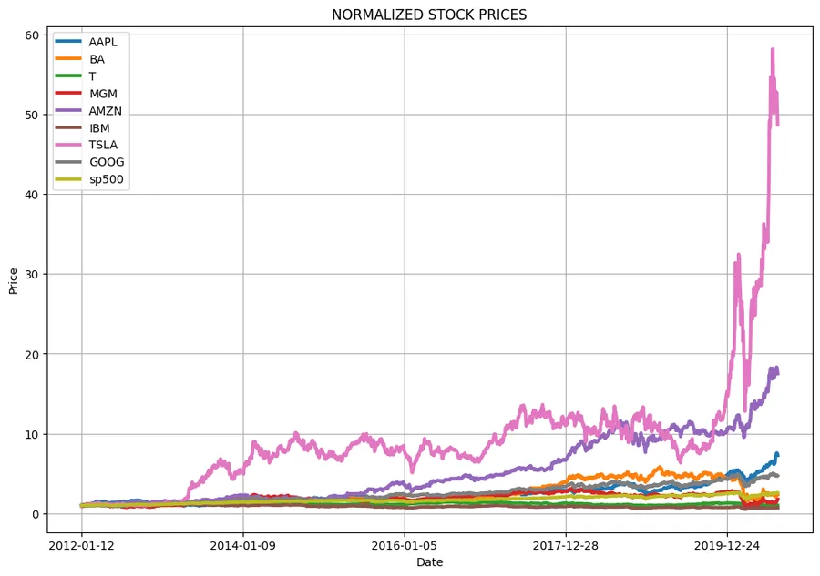
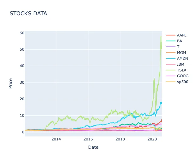
- Price Normalisation: Created a custom normalize() function to standardize all stock prices to their starting values, enabling fair comparison of relative performance across different price ranges.
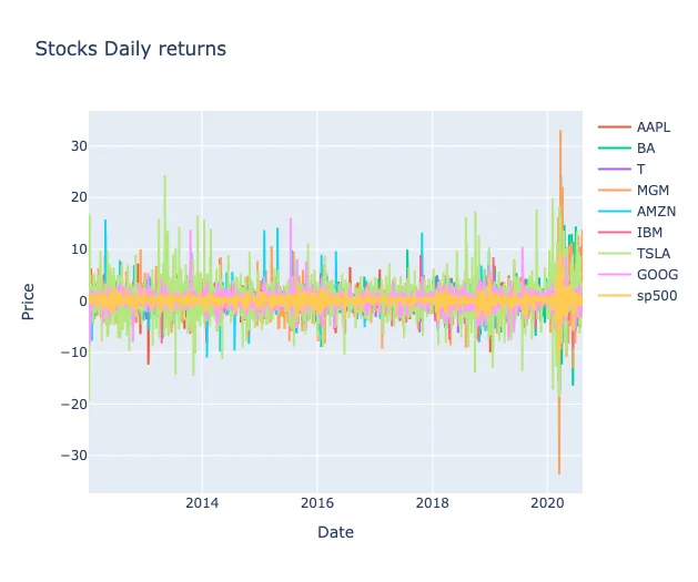
- Daily Returns Calculations: Built a daily_return() function using nested loops to compute percentage daily returns: ((current_price - previous_price) / previous_price) * 100 for each stock.
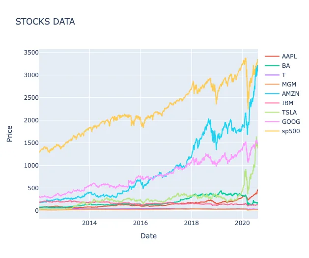
- Visualisation: Developed reusable plotting functions show_plot() and interactive_plot() to create both static matplotlib charts and interactive Plotly visualizations for raw prices, normalized prices, and daily returns.
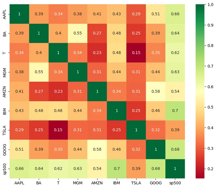
- Correlation Analysis: Generated a correlation matrix using .corr() and visualized it with a Seaborn heatmap to identify relationships between stock movements.
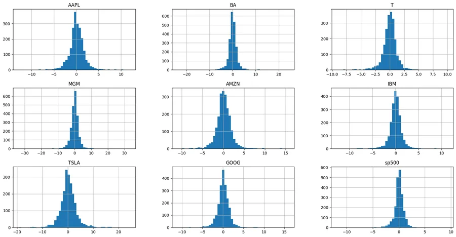
- Distribution Analysis: Created histograms and compiled distribution plots using Plotly’s create_distplot() to analyze the statistical properties of daily returns.
Key implementation decision
Separate long-run price movement from short-run return behaviour
Normalised prices make relative growth comparable, while daily returns expose short-term volatility. Keeping both views prevents a smooth price chart from hiding the variability experienced day to day.
def normalize(df):
    x = df.copy()
    for stock in x.columns[1:]:
        x[stock] = x[stock] / x[stock][0]
    return x

def daily_return(df):
    out = df.copy()
    for stock in df.columns[1:]:
        for j in range(1, len(df)):
            out[stock][j] = ((df[stock][j] - df[stock][j-1]) / df[stock][j-1]) * 100
        out[stock][0] = 0
return outResults & evidence
The figures below are the project evidence I would show first. The full implementation remains available through the GitHub link at the top of the page.
What challenged me
The daily returns calculation initially produced incorrect values for the first row of each stock. After debugging, the issue was that there’s no previous day to calculate a return from for the first entry. This was solved by explicitly setting the first day’s return to 0 using df_daily_return[i][0] = 0 after the loop calculation, ensuring accurate percentage calculations for all subsequent days.
What I learned
- Rebased prices and daily returns answer different questions about the same series.
- Correlation can reveal common movement, but it does not by itself establish why stocks moved together.
- The first observation in a return series has no previous day and needs an explicit convention or missing value.
What I would improve next
- Vectorise the return calculation with pandas percentage-change operations.
- Separate correlation description from causal interpretation of common market drivers.
- Add rolling volatility and rolling correlation to show how relationships change over time.
The project is exploratory rather than predictive. Its strongest contribution is showing how the same market can look different depending on whether the analysis is performed on levels, rebased levels or returns.