Technical case study
Global Population Trends Exploration
An exploratory World Bank analysis linking birth rate, internet use and life expectancy across countries, regions and income groups.
The problem
This project used World Bank development indicators to explore trends in population growth, urbanisation, and fertility rates across continents and income groups. The objective was to uncover insights about global development patterns over time using Python.
What development patterns become visible when demographic and socioeconomic indicators are merged at country level and compared across groups?
Approach
Rather than presenting the project as a notebook dump, this case study focuses on the decisions that shaped the analysis.
- Load & inspect data: Loaded the dataset using pd.read_csv() and inspected structure with .info() and .head() to understand column types and missing data.
- Cleaning: Renamed columns, removed irrelevant rows, and addressed missing values for smoother analysis.
- Initial exploration: Examined fertility rates, population growth, and urban population across income levels and continents.
- Grouping & Summarisation: Used groupby() and mean() to aggregate indicators by continent and income level.
- Visualisation: Created scatter plots, line plots, and box plots to reveal relationships between population metrics and economic status.
Key implementation decision
Build a common country key before comparing indicators
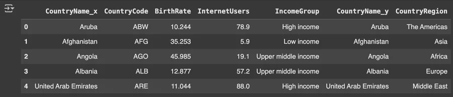
The analysis depends on joining multiple indicator sources consistently. Country codes provide a stable key that lets life expectancy and regional metadata be brought into the same analytical frame.
country_data = pd.DataFrame({
    "CountryName": np.array(Countries_2012_Dataset),
    "CountryCode": np.array(Codes_2012_Dataset),
    "CountryRegion": np.array(Regions_2012_Dataset),
})

merged_data = pd.merge(
    left=data, right=country_data, how="inner", on="CountryCode"
)

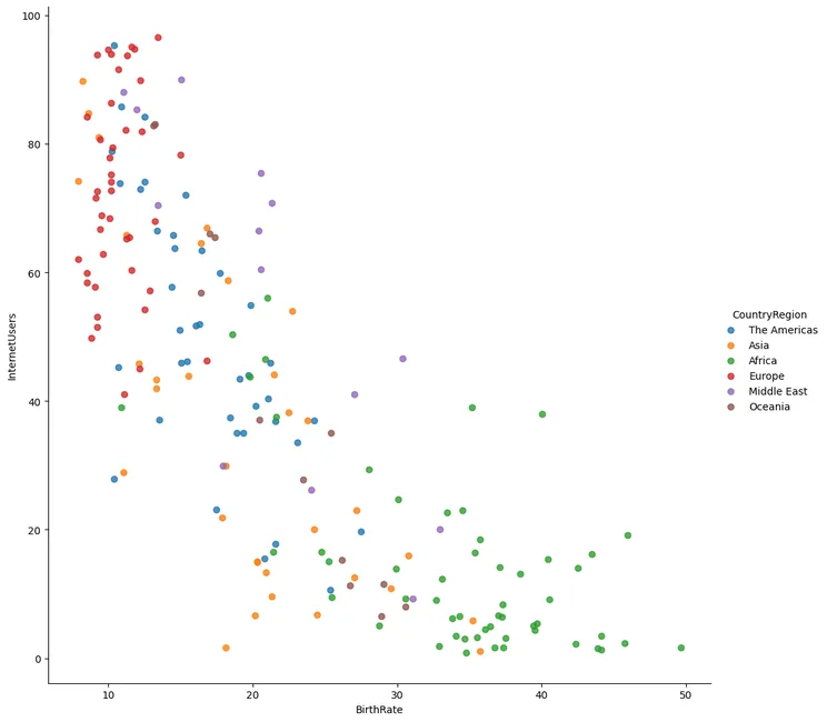
vis = sns.lmplot(
    data=merged_data, x="BirthRate", y="InternetUsers",
    fit_reg=False, hue="CountryRegion", height=10
)Results & evidence
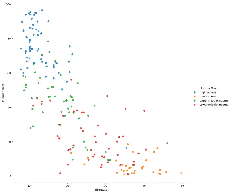
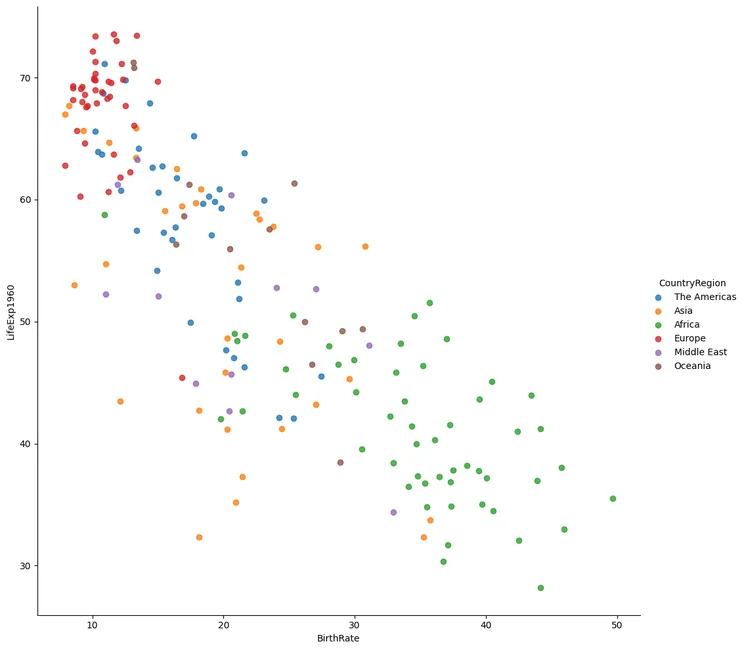
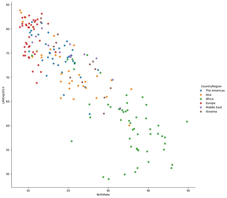
The figures below are the project evidence I would show first. The full implementation remains available through the GitHub link at the top of the page.

What challenged me
Filtering and reshaping the dataset for multi-variable analysis was complex due to inconsistent column names and missing data. I solved this by methodically renaming columns and using .dropna() to exclude incomplete records while maintaining dataset integrity.
What I learned
- Reliable joins are foundational when development indicators come from multiple country-level sources.
- Regional and income-group colour encodings made cross-country patterns easier to inspect.
- Missing-data handling can materially change a cross-country comparison and should be documented explicitly.
What I would improve next
- Document missing-data decisions explicitly instead of silently excluding incomplete observations.
- Add temporal comparisons so cross-sectional patterns are not confused with long-term change.
- Quantify group differences with summary statistics before interpreting the visual separation.
The core difficulty in this project is relational rather than algorithmic: indicators from different sources only become comparable after the country metadata and measures are aligned correctly.