Technical case study
Financial Statement Analysis
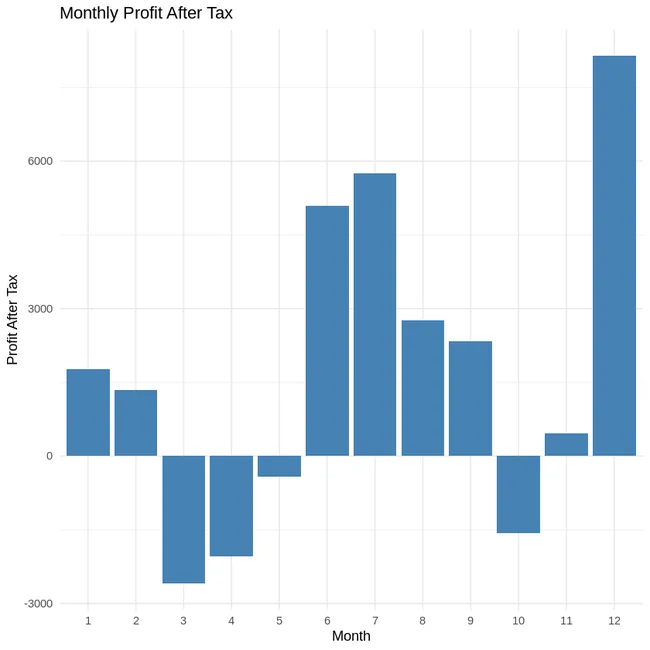
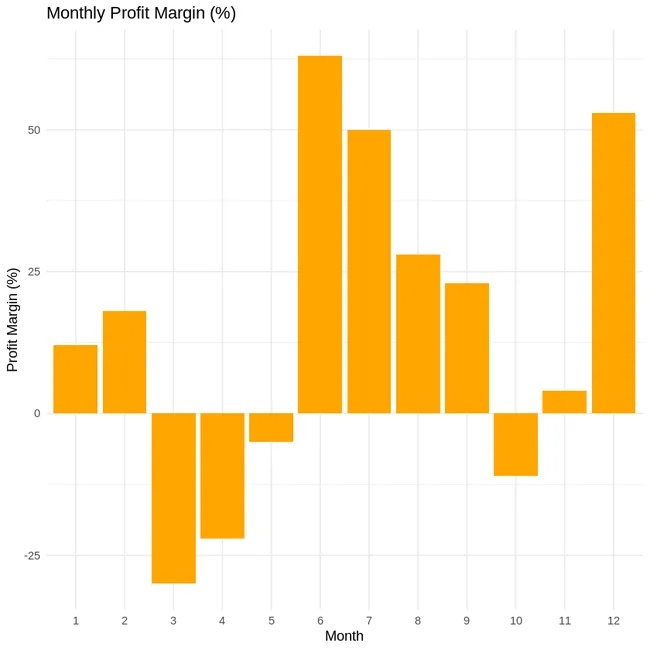
An R-based profitability analysis that calculates profit after tax and profit margin, then visualises monthly financial performance.
The problem
This project uses R to calculate and visualise profit after tax and profit margin from revenue and expense data. I have deliberately narrowed this case-study narrative to the analysis demonstrated by the current code rather than claiming a broader statement-analysis scope that is not shown on the page.
How can simple financial calculations and visualisations turn raw revenue and expense data into an interpretable operating-performance view?
The current repository code shown here is an R-based monthly profit and margin exercise. I have kept this case study aligned with that implementation instead of presenting unsupported multi-year statement analysis.
Approach
Rather than presenting the project as a notebook dump, this case study focuses on the decisions that shaped the analysis.
- Load & inspect data: Imported multi-statement CSV into pandas. Extracted relevant sections for Balance Sheet, Income Statement, and Cash Flow Statement using loc[] .
- Trend Analysis: Plotted major components (e.g. assets, equity) using .plot() to visualise financial stability over time.
- Ratio Calculations: Computed solvency and profitability ratios: Return on Equity (ROE), Return on Assets (ROA), Debt-to-Equity. Built DataFrame to summarise and visualise using grouped bar plots.
- Custom Metrics: Created Operating Cash Flow to Total Debt ratio from cash flow and balance sheet sections to assess short-term liquidity strength.
Key implementation decision
Calculate the business metric first, then build the visual around it
The plots are downstream of the accounting logic. Profit, tax and margin are calculated explicitly before they are visualised, making the chart a presentation of the metric rather than the place where the metric is defined.
profit <- revenue - expenses
tax <- round(0.30 * profit, 2)
profit.after.tax <- profit - tax

profit.margin <- round(profit.after.tax / revenue, 2) * 100

data <- data.frame(
  Month = 1:12,
  Profit_Margin = profit.margin
)Results & evidence
The figures below are the project evidence I would show first. The full implementation remains available through the GitHub link at the top of the page.
What challenged me
Initially, aligning the financial statements by year was inconsistent due to mixed string/index formats across categories. I overcame this by explicitly extracting year-based columns and standardising label references. This made ratio computations and cross-statement comparisons reliable and reproducible.
What I learned
- Financial visualisations are clearer when the calculation chain is explicit before plotting begins.
- Profit-after-tax and margin tell related but different stories about operating performance.
- The narrative and source period should be kept tightly aligned so the case study does not imply analysis that the displayed code does not show.
What I would improve next
- Align the narrative and repository so the displayed analysis and stated source data describe the same period and tooling.
- Add clear source labels for each financial input.
- Extend the analysis with consistent ratio definitions and year-over-year comparisons if multi-year statements are included.
This project is best presented as a compact analytical exercise rather than a large modelling project. The useful evidence is the calculation chain and how it turns into an interpretable financial view.