Technical case study
Box Office Data Analysis
An exploratory R analysis of top-grossing US films, focusing on release timing, genre, studio and domestic gross patterns.
The problem
This project explored publicly available data on top-grossing US films to identify patterns across genres, studios, and release schedules. I used R and ggplot2 for data exploration and visualisation.
What patterns appear when release timing, genre, studio and gross are explored together rather than as isolated variables?
Approach
Rather than presenting the project as a notebook dump, this case study focuses on the decisions that shaped the analysis.
- Import & inspect data: Used read.csv() , summary() , and str()
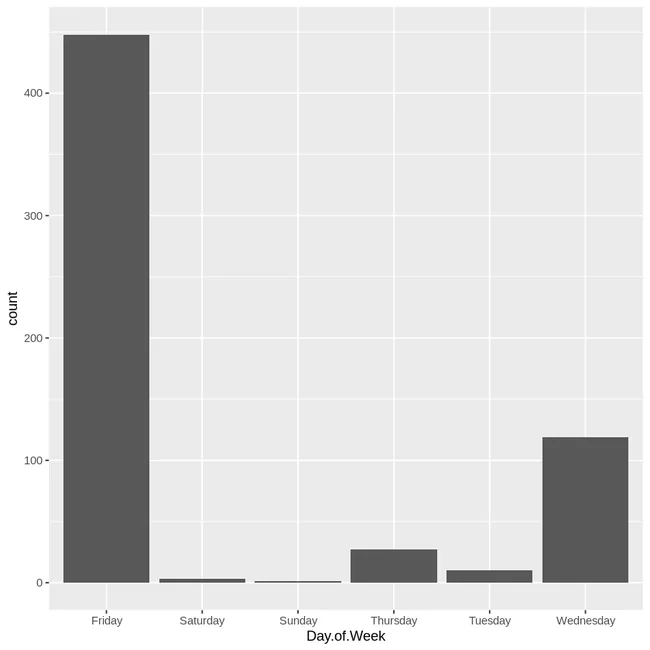
- Initial exploration: Identified no Monday releases using a bar plot of Day.of.Week
- Filtering for significance: Narrowed to key genres and major studios
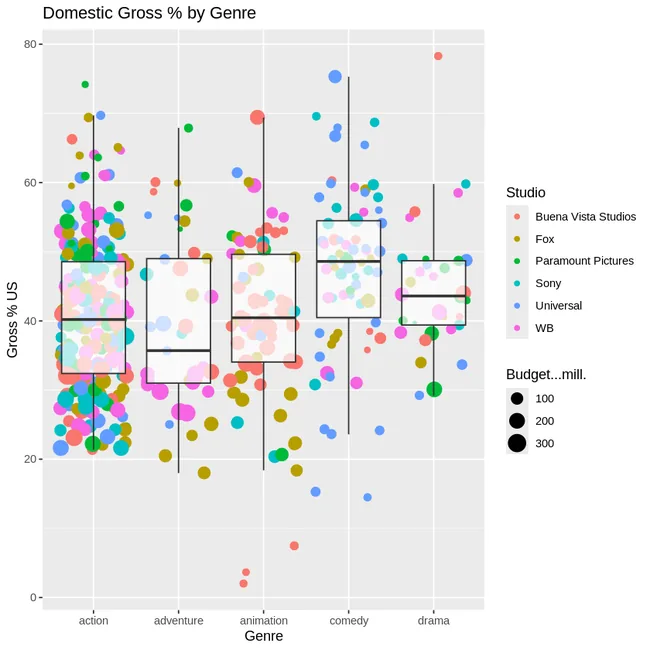
- Visualisation: Created jitter + box plots comparing domestic gross
- Aesthetics: Tuned themes for clarity and presentation
Key implementation decision
Use layered plots to preserve both distribution and individual observations
A box plot summarises the distribution, while jittered points keep the underlying films visible. Removing duplicate outlier markers and using transparency reduced visual clutter.
p <- ggplot(data = mov2, aes(x = Genre, y = Gross...US))

q <- p +
  geom_jitter(aes(size = Budget...mill., colour = Studio), alpha = 0.65) +
geom_boxplot(alpha = 0.7, outlier.colour = NA)Results & evidence
The figures below are the project evidence I would show first. The full implementation remains available through the GitHub link at the top of the page.
What challenged me
Overlapping outliers and jitter points in ggplot2 caused clutter. I resolved this with outlier.colour = NA and alpha blending.
What I learned
- Visual encoding choices can change whether patterns are legible or buried under overlapping observations.
- Filtering to meaningful genre/studio subsets made the comparison clearer than plotting every category at once.
- Exploratory patterns are prompts for further testing, not causal conclusions.
What I would improve next
- Add sample-size labels so genre comparisons are easier to contextualise.
- Test whether the apparent release-day pattern persists in a larger or more recent dataset.
- Separate exploratory observations from claims that would require statistical testing.
The project was less about fitting a model and more about learning how filtering and visual encoding change what can be seen in a dataset. That made chart construction itself an analytical decision.