Making sense of complexity through data. Leveraging AI to empower people and decisions.
Intro
This portfolio captures my journey from data analytics to machine learning. I began with projects in R and soon transitioned to Python, where I discovered the world of AI. Along the way, I've learned to build models catering to supervised and unsupervised learning. I'm currently getting more familiar with deep learning—specifically computer vision and retrieval-augmented generation. Check out some of my work here.
Projects
This section showcases hands-on projects where I apply Python and R to solve real-world problems. From data cleaning to model evaluation, each project includes a clear data pipeline, code snippets, and key takeaways. You'll also find notes on the challenges I faced and how I overcame them, offering insight into my problem-solving approach.
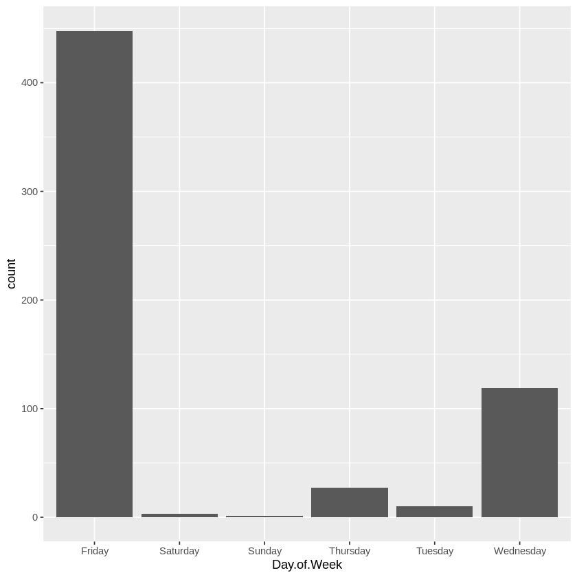
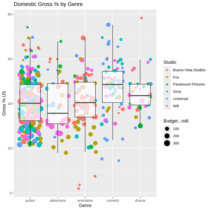
This project explored publicly available data on top-grossing US films to identify patterns across genres, studios, and release schedules. I used R and ggplot2 for data exploration and visualisation.
💻 Tech Stack:
R for data manipulation and visualisation
ggplot2 for creating custom, layered visual insights
🧪 Data Pipeline:
Import & inspect data: Used read.csv(), summary(), and str()
Initial exploration: Identified no Monday releases using a bar plot of Day.of.Week
Filtering for significance: Narrowed to key genres and major studios
Visualisation: Created jitter + box plots comparing domestic gross
Aesthetics: Tuned themes for clarity and presentation
This project analysed five years of company financial data (2018–2022), including Balance Sheet, Income Statement, and Cash Flow Statement. I used Python and pandas to calculate key financial ratios, identify operational trends, and visualise multi-year performance.
💻 Tech Stack:
R for data manipulation and analysis
Pandas for computations
Matplotlib for plotting financial visualisations
🧪 Data Pipeline:
Load & inspect data: Imported multi-statement CSV into pandas. Extracted relevant sections for Balance Sheet, Income Statement, and Cash Flow Statement using loc[].
Trend Analysis: Plotted major components (e.g. assets, equity) using .plot() to visualise financial stability over time.
Ratio Calculations: Computed solvency and profitability ratios: Return on Equity (ROE), Return on Assets (ROA), Debt-to-Equity. Built DataFrame to summarise and visualise using grouped bar plots.
Custom Metrics: Created Operating Cash Flow to Total Debt ratio from cash flow and balance sheet sections to assess short-term liquidity strength.
📊 Code Snippets & Visualisations:
# Load required libraries for visualizations
library(ggplot2)
library(tidyverse)
# Data
revenue <- c(14574.49, 7606.46, 8611.41, 9175.41, 8058.65, 8105.44,
11496.28, 9766.09, 10305.32, 14379.96, 10713.97, 15433.50)
expenses <- c(12051.82, 5695.07, 12319.20, 12089.72, 8658.57, 840.20,
3285.73, 5821.12, 6976.93, 16618.61, 10054.37, 3803.96)
# Calculate Profit As The Difference Between Revenue And Expenses
profit <- revenue - expenses
profit
# Calculate Tax As 30% Of Profit And Round To 2 Decimal Places
tax <- round(0.30 * profit, 2)
tax
# Calculate Profit Remaining After Tax Is Deducted
profit.after.tax <- profit - tax
profit.after.tax
# Visualize Profit After Tax
# Create a data frame for visualization
data <- data.frame(
Month = 1:12,
Profit_After_Tax = profit.after.tax
)
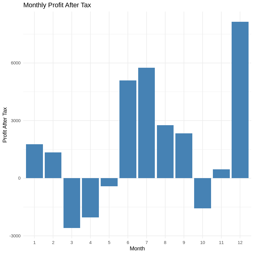
# Create the bar chart using ggplot2 (Figure 1)
ggplot(data, aes(x = factor(Month), y = Profit_After_Tax)) +
geom_bar(stat = "identity", fill = "steelblue") +
labs(title = "Monthly Profit After Tax", x = "Month", y = "Profit After Tax") +
theme_minimal()
# Calculate The Profit Margin As Profit After Tax Over Revenue
profit.margin <- round(profit.after.tax / revenue, 2) * 100
profit.margin
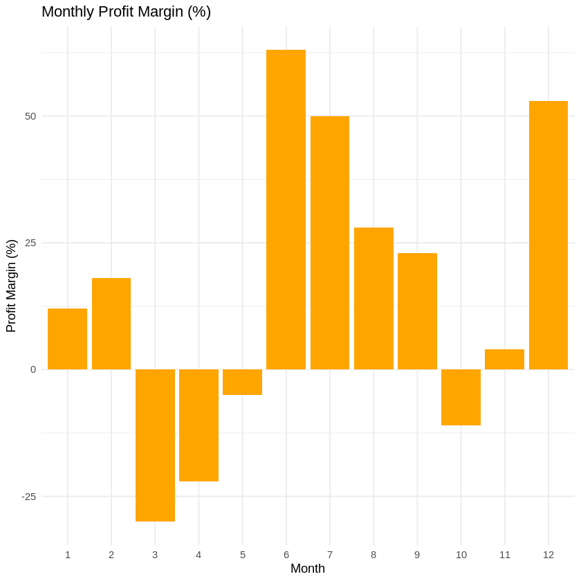
# Visualize Profit Margin
# Create a data frame for visualization
data <- data.frame(
Month = 1:12,
Profit_Margin = profit.margin
)
# Create the bar chart using ggplot2 (Figure 2)
ggplot(data, aes(x = factor(Month), y = Profit_Margin)) +
geom_bar(stat = "identity", fill = "orange") +
labs(title = "Monthly Profit Margin (%)", x = "Month", y = "Profit Margin (%)") +
theme_minimal()
# Calculate The Mean Profit After Tax For The 12 Months
mean_pat <- mean(profit.after.tax)
mean_pat
# Find The Months With Above-Mean Profit After Tax
good.months <- profit.after.tax > mean_pat
good.months
# Bad Months Are The Opposite Of Good Months
bad.months <- !good.months
bad.months
# The Best Month Is The Month With The Highest Profit After Tax
best.month <- profit.after.tax == max(profit.after.tax)
best.month
# The Worst Month Is The Month With The Lowest Profit After Tax
worst.month <- profit.after.tax == min(profit.after.tax)
worst.month
Figure 1 Profit After TaxFigure 2 Profit Margin
🌟 Key Insights:
The company showed stable asset growth and rising equity, but the Debt-to-Equity ratio increased post-2020, signalling higher leverage risk.
Operating cash flow was consistently positive, suggesting sufficient liquidity to meet short-term obligations — a green flag for operational health.
🧗🏾 Challenge Faced:
Initially, aligning the financial statements by year was inconsistent due to mixed string/index formats across categories. I overcame this by explicitly extracting year-based columns and standardising label references. This made ratio computations and cross-statement comparisons reliable and reproducible.
This project used World Bank development indicators to explore trends in population growth, urbanisation, and fertility rates across continents and income groups. The objective was to uncover insights about global development patterns over time using Python.
💻 Tech Stack:
Python for data handling and exploration
Pandas for data manipulation
Matplotlib for visualisations
🧪 Data Pipeline:
Load & inspect data: Loaded the dataset using pd.read_csv() and inspected structure with .info() and .head() to understand column types and missing data.
Cleaning: Renamed columns, removed irrelevant rows, and addressed missing values for smoother analysis.
Initial Exploaration: Examined fertility rates, population growth, and urban population across income levels and continents.
Grouping & Summarisation: Used groupby() and mean() to aggregate indicators by continent and income level.
Visualisation: Created scatter plots, line plots, and box plots to reveal relationships between population metrics and economic status.
📊 Code Snippets & Visualisations:
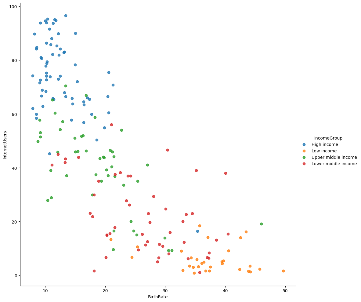
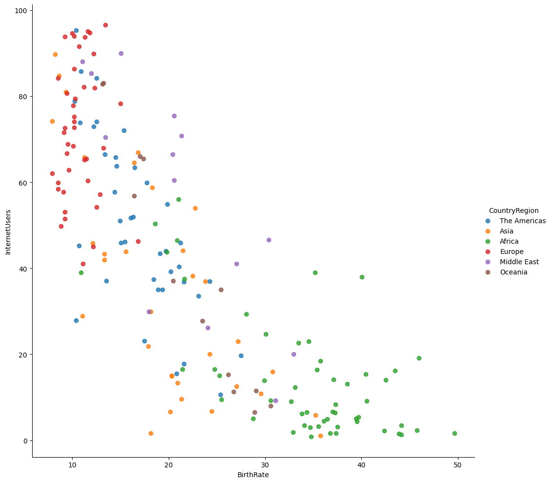
# Plot the BirthRate versus Internet Users categorised by Income Group (Figure 1)
vis1 = sns.lmplot(
data=data,
x='BirthRate',
y='InternetUsers',
fit_reg=False,
hue='IncomeGroup',
height=10
)
# Create the dataframe
country_data = pd.DataFrame({
'CountryName': np.array(Countries_2012_Dataset),
'CountryCode': np.array(Codes_2012_Dataset),
'CountryRegion': np.array(Regions_2012_Dataset)
})
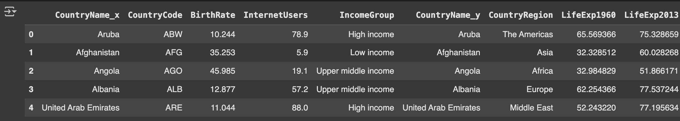
# Merge country data to the original dataframe (Table 1)
merged_data = pd.merge(
left=data,
right=country_data,
how='inner',
on='CountryCode'
)
merged_data.head()
# Create a data frame with the life expectancy
life_exp_data = pd.DataFrame({
'CountryCode': np.array(Country_Code),
'LifeExp1960': np.array(Life_Expectancy_At_Birth_1960),
'LifeExp2013': np.array(Life_Expectancy_At_Birth_2013)
})
# Merge the data frame with the life expectancy
merged_data1 = pd.merge(
left=merged_data,
right=life_exp_data,
how='inner',
on='CountryCode'
)
# Explore the dataset (Table 2)
merged_data1.head()
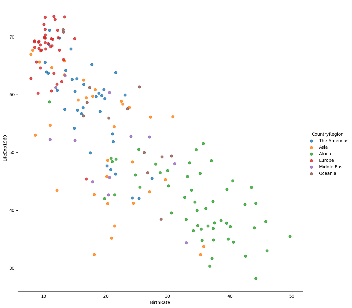
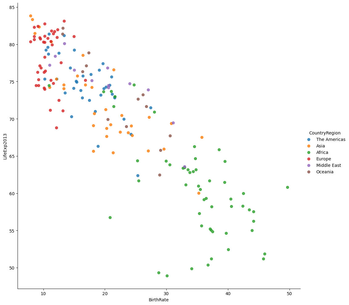
# Plot the BirthRate versus LifeExpectancy categorised by Country Region in 1960 (Figure 3)
vis3 = sns.lmplot(
data=merged_data1,
x='BirthRate',
y='LifeExp1960',
fit_reg=False,
hue='CountryRegion',
height=10
)
# Plot the BirthRate versus LifeExpectancy categorised by Country Region in 2013 (Figure 4)
vis4 = sns.lmplot(
data=merged_data1,
x='BirthRate',
y='LifeExp2013',
fit_reg=False,
hue='CountryRegion',
height=10
)
Table 1 Merged DFTable 2 Merged DF 2Figure 1 BirthRate versus Internet Users categorised by Income GroupFigure 2 BirthRate versus Internet Users categorised by Country RegionFigure 3 BirthRate versus LifeExpectancy in 1960Figure 4 BirthRate versus LifeExpectancy in 2013
🌟 Key Insights:
Countries with lower income levels showed higher fertility rates and population growth.
Urban population tends to correlate with income level, especially in developed regions.
Africa stands out with higher fertility rates and population growth compared to other continents.
🧗🏾 Challenge Faced:
Filtering and reshaping the dataset for multi-variable analysis was complex due to inconsistent column names and missing data. I solved this by methodically renaming columns and using .dropna() to exclude incomplete records while maintaining dataset integrity.
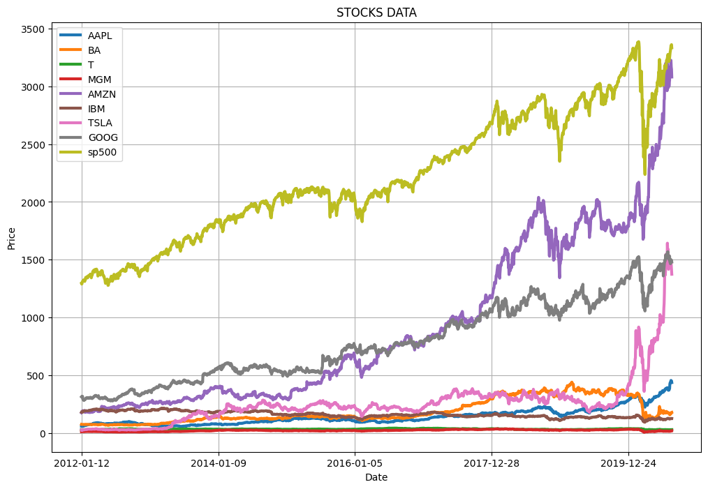
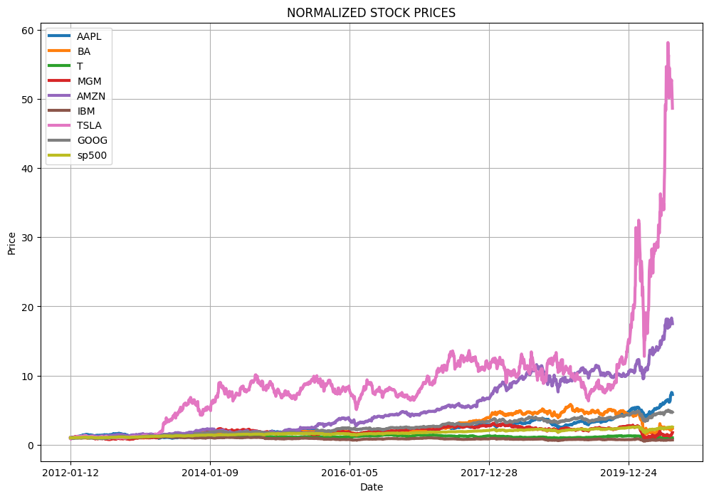
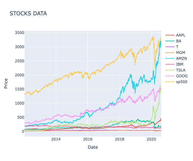
This project analyzed historical stock price data for major companies and the S&P 500 index to understand price movements, correlations, and daily return patterns. I built an interactive dashboard using Python's data science stack to visualize both raw and normalized stock performance alongside risk metrics.
💻 Tech Stack:
Python for data manipulation and analysis
Pandas for computations
Matplotlib & Seaborn for static visualisations
Plotly for interactive charts and dashboards
NumPy & SciPy for statistical computations
🧪 Data Pipeline:
Explore data: Loaded stock price data using pd.read_csv() and explored the dataset structure with .info(), .describe(), and .head() to understand the time series format and identify key stocks. Checked for missing values using .isnull().sum() and calculated basic statistics like mean returns and standard deviation to assess data completeness and variability.
Price Normalisation: Created a custom normalize() function to standardize all stock prices to their starting values, enabling fair comparison of relative performance across different price ranges.
Daily Returns Calculations: Built a daily_return() function using nested loops to compute percentage daily returns: ((current_price - previous_price) / previous_price) * 100 for each stock.
Visualisation: Developed reusable plotting functions show_plot() and interactive_plot() to create both static matplotlib charts and interactive Plotly visualizations for raw prices, normalized prices, and daily returns.
Correlation Analysis: Generated a correlation matrix using .corr() and visualized it with a Seaborn heatmap to identify relationships between stock movements.
Distribution Analysis: Created histograms and compiled distribution plots using Plotly's create_distplot() to analyze the statistical properties of daily returns.
📊 Code Snippets & Visualisations:
def show_plot(df, title):
    df.plot(x='Date', figsize=(12, 8), linewidth=3, title=title)
    plt.xlabel('Date')
    plt.ylabel('Price')
    plt.grid()
    plt.show()

# Plot the data (Figure 1)
show_plot(stocks_df, 'STOCKS DATA')

# Normalized Stock Data (Figure 2)
def normalize(df):
    x = df.copy()
    for i in x.columns[1:]:
        x[i] = x[i] / x[i][0]
    return x

normalize(stocks_df)

# Create Interactive chart of Stock Data (Figure 3)
def interactive_plot(df, title):
    fig = px.line(title=title)
    for i in df.columns[1:]:
        fig.add_scatter(x=df['Date'], y=df[i], name=i)
    fig.update_layout(
        xaxis_title="Date",
        yaxis_title="Price"
    )
    fig.show()

interactive_plot(stocks_df, 'STOCKS DATA')

# Create Interactive chart of Normalized Stock Data (Figure 4)
interactive_plot(normalize(stocks_df), 'STOCKS DATA')

# Calculate stocks daily returns
def daily_return(df):
    df_daily_return = df.copy()
    for i in df.columns[1:]:  # loop through columns
        for j in range(1, len(df)):  # loop through rows
            df_daily_return[i][j] = ((df[i][j] - df[i][j - 1]) / df[i][j - 1]) * 100
        df_daily_return[i][0] = 0
    return df_daily_return

# Get the daily returns (Figure 5)
stocks_daily_return = daily_return(stocks_df)
stocks_daily_return

interactive_plot(stocks_daily_return, 'Stocks Daily returns')

# Daily Return Correlation
cm = stocks_daily_return.drop(columns=['Date']).corr()
cm

# Heatmap showing correlations (Figure 6)
plt.figure(figsize=(10, 8))
sns.heatmap(cm, annot=True, cmap='RdYlGn')  # `annot=True` displays values on the heatmap
plt.show()

# Histogram of daily returns (Figure 7)
stocks_daily_return.hist(bins=50, figsize=(20, 10))
plt.show()
Stock movements are highly correlated across companies, indicating that broader market forces often drive price trends rather than company-specific factors.
Daily returns fluctuate far more than overall price trends suggest, revealing short-term volatility that long-term averages tend to conceal.
Volatility patterns differ by stock, with some showing consistently wider swings in daily returns — signalling higher risk and potential reward compared to more stable peers.
🧗🏾 Challenge Faced:
The daily returns calculation initially produced incorrect values for the first row of each stock. After debugging, the issue was that there's no previous day to calculate a return from for the first entry. This was solved by explicitly setting the first day's return to 0 using df_daily_return[i][0] = 0 after the loop calculation, ensuring accurate percentage calculations for all subsequent days.
This project built a comprehensive portfolio management system that simulates random asset allocation across major stocks and calculates key financial metrics including returns, volatility, and risk-adjusted performance. I developed a complete portfolio analytics framework using Python to evaluate investment strategies and portfolio performance over time.
💻 Tech Stack:
Python for financial calculations and portfolio modeling
Pandas for time series data manipulation and financial computations
NumPy for random weight generation and mathematical operations
Plotly & SciPy for interactive portfolio performance visualisation, statistical analysis and risk metrics
🧪 Data Pipeline:
Data Preparation: Loaded and sorted stock data chronologically using sort_values() by Date to ensure proper time series analysis for portfolio calculations.
Random Portfolio Generation: Used np.random.seed() and np.random.seed(9) to create randomized asset allocation weights, then normalized them using weights / np.sum(weights) to ensure they sum to 100%.
Portfolio Normalisation: Applied a custom normalize() function to standardize all stock prices to their initial values, creating a baseline for relative performance comparison across different price ranges.
Portfolio function development: Built a reusable portfolio_allocation() function that encapsulates the entire workflow for testing different weight combinations and portfolio strategies.
Risk metrics calculation: Computed cumulative return, standard deviation (volatility), average daily return, and Sharpe ratio (assessesment of the risk-adjusted returns of an investment) using np.sqrt(252) for annualization.
📊 Code Snippets & Visualisations:
np.random.seed()
# Create random weights for the stocks
weights = np.array(np.random.random(9))
# Random Asset Allocation & Calculate Portfolio Daily Return
weights = weights / np.sum(weights)
print(weights)
# Define Normalization function
def normalize(df):
x = df.copy()
for i in x.columns[1:]:
x[i] = x[i] / x[i][0]
return x
# Enumerate returns the value and a counter as well
for counter, stock in enumerate(df_portfolio.columns[1:]):
df_portfolio[stock] = df_portfolio[stock] * weights[counter]
df_portfolio[stock] = df_portfolio[stock] * 1000000
# Calculate the portfolio daily return
df_portfolio['portfolio daily % return'] = 0.0000
for i in range(1, len(stocks_df)):
# Calculate the percentage of change from the previous day
df_portfolio['portfolio daily % return'][i] = (
(df_portfolio['portfolio daily worth/$'][i] - df_portfolio['portfolio daily worth/$'][i - 1])
/ df_portfolio['portfolio daily worth/$'][i - 1]
) * 100
# Create a function for stock portfolio allocation
# Assume $1000000 is total amount for portfolio
def portfolio_allocation(df, weights):
df_portfolio = df.copy()
# Normalize the stock values
df_portfolio = normalize(df_portfolio)
for counter, stock in enumerate(df_portfolio.columns[1:]):
df_portfolio[stock] = df_portfolio[stock] * weights[counter]
df_portfolio[stock] = df_portfolio[stock] * 1000000
df_portfolio['portfolio daily worth in $'] = df_portfolio[df_portfolio.columns[1:]].sum(axis=1)
df_portfolio['portfolio daily % return'] = 0.0000
for i in range(1, len(stocks_df)):
# Calculate the percentage of change from the previous day
df_portfolio['portfolio daily % return'][i] = (
(df_portfolio['portfolio daily worth in $'][i] - df_portfolio['portfolio daily worth in $'][i - 1])
/ df_portfolio['portfolio daily worth in $'][i - 1]
) * 100
# Set the value of first row to zero, as previous value is not available
df_portfolio['portfolio daily % return'][0] = 0
return df_portfolio
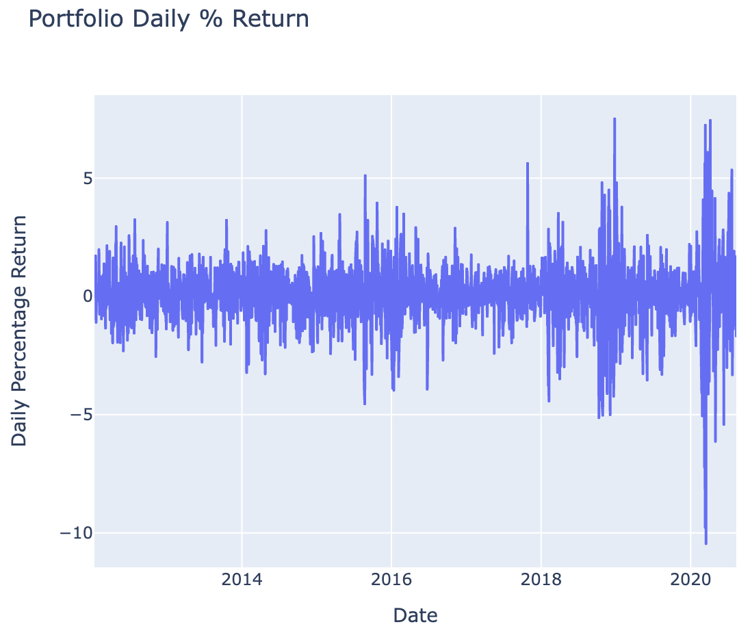
# Plot the portfolio daily return (Figure 1)
fig = px.line(
x=df_portfolio.Date,
y=df_portfolio['portfolio daily % return'],
title='Portfolio Daily % Return',
labels={"x": "Date", "y": "Daily Percentage Return"}
)
fig.show()
# Cumulative return of the portfolio
cumulative_return = (
(df_portfolio['portfolio daily worth/$'][-1:] - df_portfolio['portfolio daily worth/$'][0])
/ df_portfolio['portfolio daily worth/$'][0]
) * 100
print('Cumulative return of the portfolio is {} %'.format(cumulative_return.values[0]))
# Calculate the average daily return
print('Average daily return of the portfolio is {} %'.format(df_portfolio['portfolio daily % return'].mean()))
# Portfolio Sharpe ratio
sharpe_ratio = (
df_portfolio['portfolio daily % return'].mean()
/ df_portfolio['portfolio daily % return'].std()
* np.sqrt(252)
)
print('Sharpe ratio of the portfolio is {}'.format(sharpe_ratio))
Figure 1 Portfolio Daily Returns (%)
🌟 Key Insights:
Random portfolio allocation provides baseline performance benchmarks for comparing against optimized strategies, revealing how diversification across 9 stocks performs under equal-weight and random-weight scenarioss
Daily return volatility patterns indicate portfolio risk characteristics with higher volatility periods corresponding to market stress, while Sharpe ratio quantifies whether returns adequately compensate for risk takeno
Normalization to Day 1 baseline enables fair comparison across stocks with different price levels, allowing proper weight allocation based on percentage changes rather than absolute dollar amounts
Cumulative returns demonstrated the compound effect of daily performance over the investment period
🧗🏾 Challenge Faced:
I initially encountered an indexing error when calculating portfolio daily returns because I was trying to access the previous day's value for the first row, which doesn't exist. The calculation df_portfolio['portfolio daily % return'][i-1] failed on the first iteration. I solved this by explicitly setting the first day's return to 0 using df_portfolio['portfolio daily % return'][0] = 0 after the loop, and ensuring the loop started from index 1 rather than 0. This approach properly handled the edge case while maintaining accurate percentage calculations for all subsequent trading days.
Understanding Market Exposure: A CAPM-Based Stock Evaluation
This project emerged from a natural curiosity sparked during my earlier stock market analysis, where I explored daily return patterns and volatility trends. That initial exploration raised deeper questions: How do individual stocks behave in relation to market-wide movements?Can risk be quantified and priced? These questions led me to explore Beta (market sensitivity), Alpha (excess returns), and the Capital Asset Pricing Model (CAPM)—a foundational framework in modern finance.
💻 Tech Stack:
Python for financial calculations and statistical analysis
Pandas for time series data manipulation and daily returns calculations
NumPy for linear regression and polynomial fitting
Seaborn for enhanced statistical plotting capabilities
Plotly Express for interactive CAPM analysis charts
Matplotlib for static scatter plots and regression line visualisation
🧪 Data Pipeline:
Market benchmark analysis: Used S&P 500 as the market proxy and calculated average daily returns using .drop('Date', axis=1).mean() to establish baseline market performance.
Beta & Alpha computation: Applied np.polyfit() with order=1 to perform linear regression between individual stock returns and S&P 500 returns, extracting beta (slope) and alpha (intercept) coefficients.
Batch analysis automation: Developed loops to iterate through all stocks (excluding S&P 500 and Date columns) using conditional statements if i != 'sp500' and i != 'Date' to calculate beta and alpha for each stock systematically.
Interactive dashboard creation: Built Plotly Express scatter plots with px.scatter() and added regression lines using fig.add_scatter() to create interactive CAPM analysis charts for each stock.
Risk metrics storage: Used Python dictionaries beta = {} and alpha = {} to store calculated coefficients for each stock, enabling easy comparison and further analysis.
📊 Code Snippets & Visualisations:
# Function to calculate the daily returns
def daily_returns(df):
df_daily_return = df.copy()
for i in df.columns[1:]:
for j in range(1, len(df)):
df_daily_return[i][j] = ((df[i][j] - df[i][j-1])/df[i][j-1])*100
df_daily_return[i][0] = 0
return df_daily_return
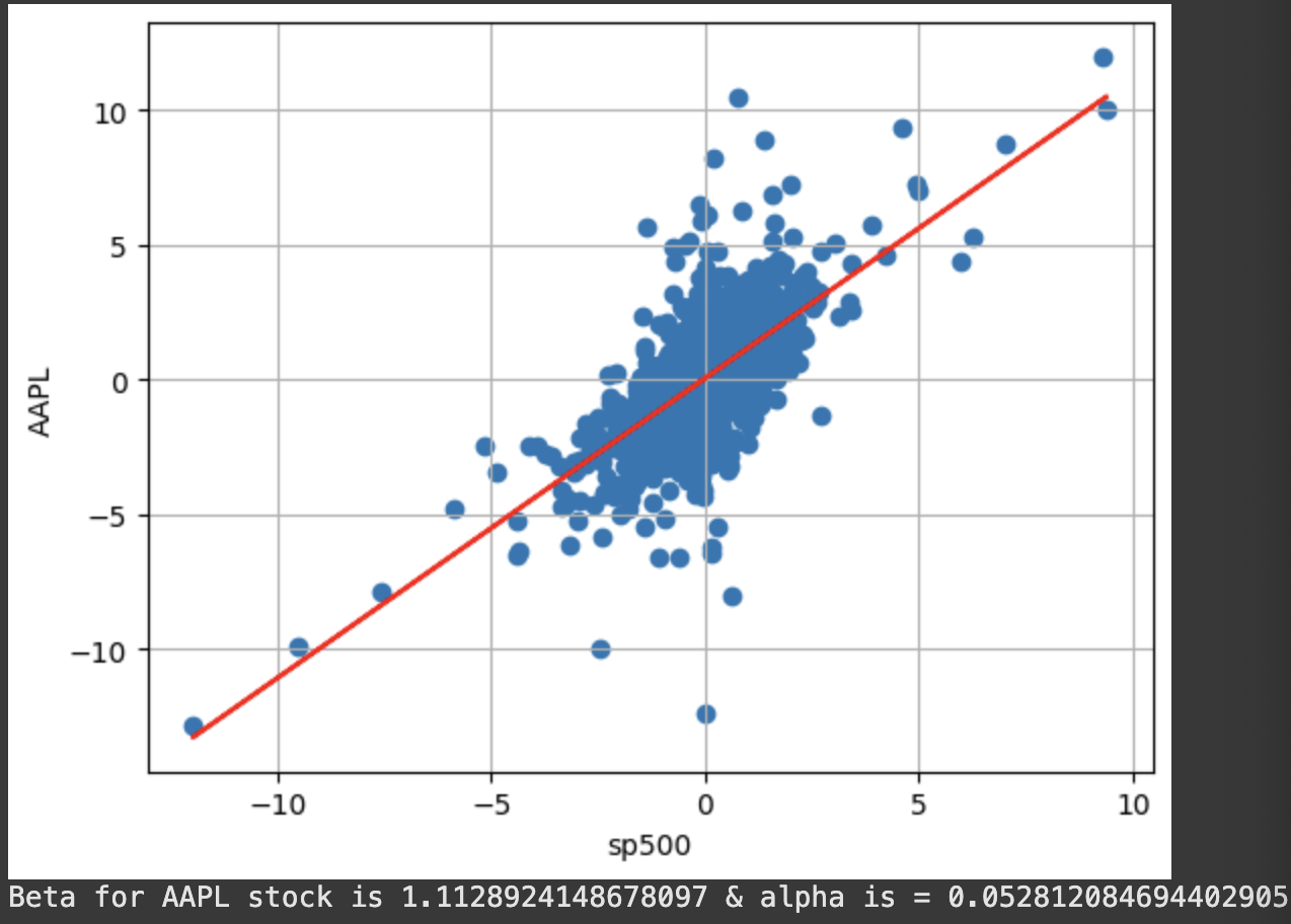
# Plot a scatter plot between the selected stock and the S&P500 (Market) (Figure 1)
plt.scatter(stocks_daily_return['sp500'], stocks_daily_return['AAPL'])
plt.xlabel('sp500')
plt.ylabel('AAPL')
plt.grid()
# Add beta & alpha to plot
beta, alpha = np.polyfit(stocks_daily_return['sp500'], stocks_daily_return['AAPL'], 1)
# Add regression line (beta) - y = beta [stockvsmkt- stock volatility] * rm [stock daily return] + alpha [excess return on top of mkt return]
plt.plot(stocks_daily_return['sp500'], beta * stocks_daily_return['sp500'] + alpha, '-', color = 'r')
plt.show()
# Let's calculate the annualized rate of return for S&P500 (Assume 252 working days per year)
rm = stocks_daily_return['sp500'].mean() * 252
rm
# Assume risk free rate is zero (Used the yield of a 10-years U.S. Government bond as a risk free rate)
rf = 0
# Calculate return for any security (APPL) using CAPM
Exp_return_AAPL = rf + (beta * (rm - rf))
Exp_return_AAPL
# Create a placeholder for all betas and alphas
beta = {}
alpha = {}
for i in stocks_daily_return.columns[1:]:
if i != 'sp500' and i != 'Date':
stocks_daily_return.plot(kind = 'scatter', x = 'sp500', y = i, title = i)
plt.scatter(stocks_daily_return['sp500'], stocks_daily_return[i])
plt.xlabel('sp500')
plt.ylabel(i)
beta[i], alpha[i] = np.polyfit(stocks_daily_return['sp500'], stocks_daily_return[i], 1)
plt.plot(stocks_daily_return['sp500'], beta[i] * stocks_daily_return['sp500'] + alpha[i], '-', color = 'r')
plt.grid()
plt.show()
print('Beta for {} stock is {} & alpha is = {}'.format('AAPL', beta, alpha))
# Apply CAPM formula to calculate the return for the Portfolio
# Obtain a list of all stock names
stock_names = list(beta.keys())
stock_names
# Define the expected return dictionary
ER = {}
rf = 0
rm = stocks_daily_return['sp500'].mean() * 252
for i in stock_names:
ER[i] = rf + (beta[i] * (rm - rf))
ER
for i in stock_names:
print('Expected return for {} is {}%'.format(i, ER[i]))
Portfolio_weights = 1/8 * np.ones(8)
# Assume equal weights in the portfolio, calculate returns
ER_portfolio = sum(list(ER.values()) * Portfolio_weights)
ER_portfolio
Figure 1
🌟 Key Insights:
Beta values revealed which stocks were more volatile than the market (beta > 1) versus defensive stocks (beta < 1)
The regression analysis showed how closely each stock's movements correlated with overall market trends
Visual scatter plots revealed the strength of linear relationships between individual stocks and market performance
🧗🏾 Challenge Faced:
I initially struggled with the loop logic for batch processing all stocks because I was accidentally including the S&P 500 index in the analysis against itself, which created perfect correlation (beta = 1, alpha = 0) and distorted my results. After debugging, I realized I needed to exclude both 'sp500' and 'Date' columns using compound conditional statements if i != 'sp500' and i != 'Date'. This solution ensured I only analyzed actual stocks against the market benchmark, providing meaningful beta and alpha calculations for investment decision-making.
This project built a multiple linear regression model to predict startup profitability based on their R&D spending, administration costs, marketing expenditure, and location. I implemented a complete machine learning pipeline using scikit-learn to analyze which factors most strongly influence startup success and revenue generation.
💻 Tech Stack:
Python for machine learning model development
Scikit-learn for preprocessing, model training, and evaluation
Pandas for dataset loading and initial data exploration
Matplotlib for data visualisations
NumPy for numerical array operations and precision control
🧪 Data Pipeline:
Data import & separation: Loaded the 50 Startups dataset using pd.read_csv() and strategically separated features (X) from the target variable (y) using .iloc[:, -1] for all columns except the last, and .iloc[:, -1] for the dependent variable (profit).
Categorical Encoding: Applied One-Hot Encoding using ColumnTransformer and OneHotEncoder() to convert the categorical 'State' variable (column index [3]) into numerical dummy variables, while keeping other numerical features intact using remainder='passthrough'.
Data transformation, model training & prediction: Used np.array(ct.fit_transform(X)) to convert the transformed data back into a NumPy array format suitable for machine learning algorithms. Implemented train_test_split() with an 80-20 split (test_size=0.2) and fixed random state (random_state=0) to ensure reproducible results and proper model validation. Instantiated and trained a LinearRegression() model using .fit(X_train, y_train) to learn the relationships between startup characteristics and profitability. Generated predictions on the test set using regressor.predict(X_test) to evaluate model performance on unseen data.
Results Visualisation: Used np.set_printoptions(precision=2) for clean output formatting and np.concatenate() with reshape() to create side-by-side comparison of predicted vs. actual values for easy performance assessment.
📊 Code Snippets & Visualisations:
# Encoding categorical data
from sklearn.compose import ColumnTransformer
from sklearn.preprocessing import OneHotEncoder
# OneHotEncoder(), [3] - the 3 is the column you want to encode
ct = ColumnTransformer(transformers=[('encoder', OneHotEncoder(), [3])], remainder='passthrough')
X = np.array(ct.fit_transform(X))
# Splitting Train and Test set
from sklearn.model_selection import train_test_split
X_train, X_test, y_train, y_test = train_test_split(X, y, test_size = 0.2, random_state = 0)
from sklearn.linear_model import LinearRegression
regressor = LinearRegression()
regressor.fit(X_train, y_train)
# Predicting Results
y_pred = regressor.predict(X_test)
np.set_printoptions(precision=2)
print(np.concatenate((y_pred.reshape(len(y_pred),1), y_test.reshape(len(y_test),1)),1))
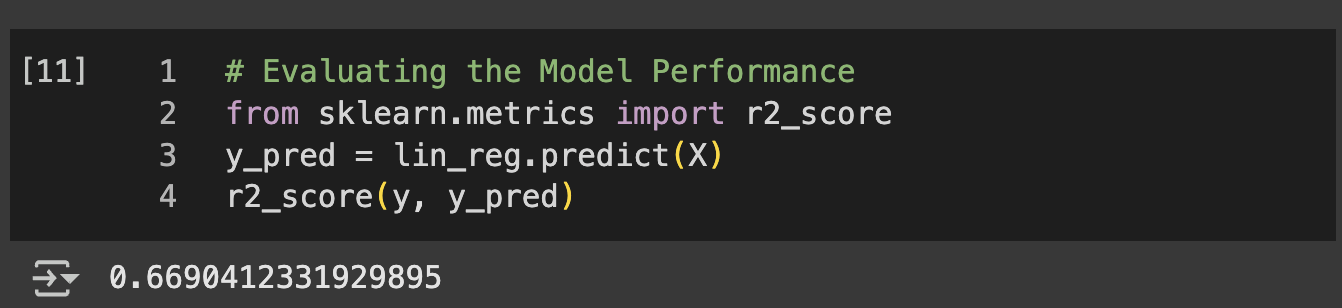
# Evaluating the Model Performance
from sklearn.metrics import r2_score
r2_score(y_test, y_pred)
Figure 1 Model Evaluation
🌟 Key Insights:
The model successfully learned to predict startup profitability based on spending patterns across R&D, administration, and marketing
One-hot encoding effectively handled the categorical state variable, allowing the model to capture location-based effects on startup success
The side-by-side prediction comparison revealed the model's accuracy in forecasting startup revenue
Multiple linear regression proved effective for understanding the linear relationships between various business expenditures and profitability
🧗🏾 Challenge Faced:
The array reshaping and concatenation for results display presented a significant hurdle because the predicted and actual values were 1D arrays that couldn't be directly concatenated horizontally. The error occurred when trying to use np.concatenate() without proper dimensionality. This was solved by using reshape(len(y_pred),1) to convert both arrays into column vectors (2D arrays with one column), then applying horizontal concatenation with the parameter 1 to stack them side-by-side. This approach created a clean comparison matrix showing predicted values next to actual values, making model performance evaluation much more intuitive.
This project implemented and compared five different regression algorithms to predict employee salaries based on position levels within an organization. I built a comprehensive machine learning pipeline comparing linear regression, polynomial regression, support vector regression (SVR), decision tree regression, and random forest regression to identify the optimal model for HR compensation analysis.
💻 Tech Stack:
Python for machine learning model development and comparison
Scikit-learn for multiple regression algorithms, feature scaling, and model training
Pandas for dataset loading and initial data exploration
Matplotlib for data visualisations
NumPy for numerical operations and grid generation
🧪 Data Pipeline:
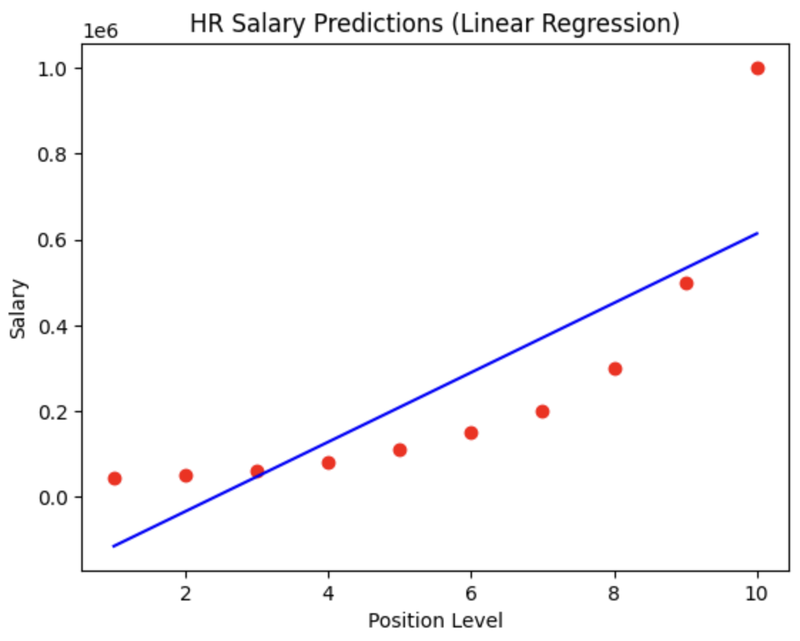
Data Preparation: Loaded position-salary dataset using pd.read_csv() and extracted features using iloc[:, 1:-1] (position levels) and target variable using iloc[:, -1] (salaries), strategically excluding the first column containing position titles.
Linear regression baseline: Implemented a standardLinearRegression() model using .fit(X, y) to establish a baseline for salary prediction based on position level with a straight-line relationship.
Polynomial feature engineering: Applied PolynomialFeatures(degree=4) to transform the single position level feature into polynomial terms (x, x², x³, x⁴), creating a richer feature space to capture non-linear salary progression patterns.
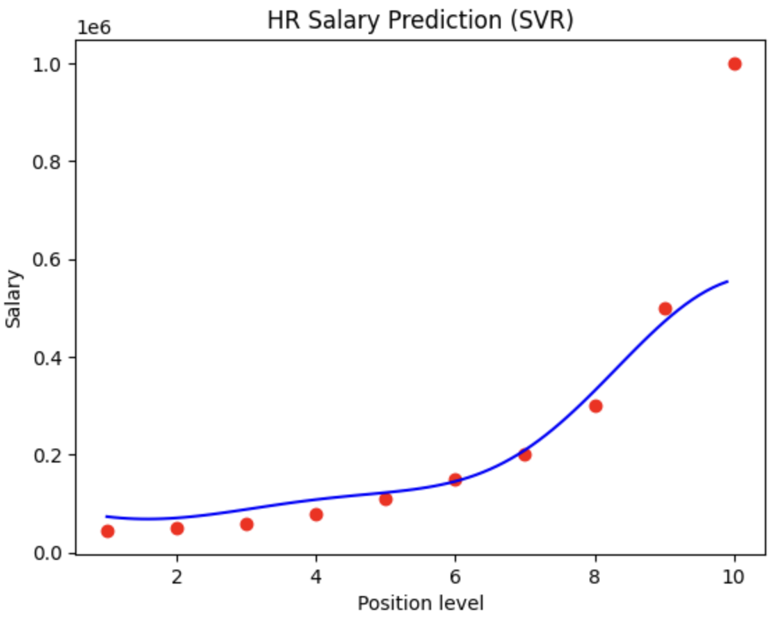
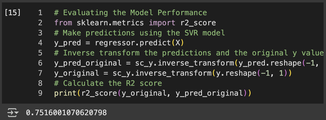
Support Vector Regression: Implemented feature scaling using StandardScaler()for both X and y variables, then trained an SVR model with RBF kernel to handle non-linear relationships while managing the different scales between position levels and salary amounts.
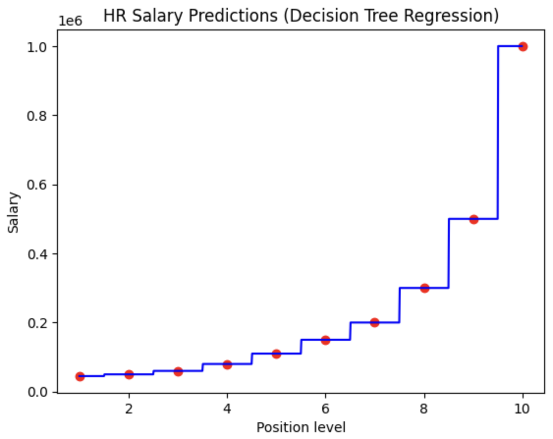
Decision Tree : Built a DecisionTreeRegressor() model that creates hierarchical decision rules to predict salaries, capturing complex non-linear patterns without requiring feature scaling.
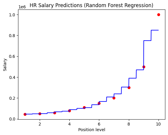
Random Forest Regression: Implemented RandomForestRegressor() with multiple decision trees to reduce overfitting and improve prediction stability through ensemble learning.
Polynomial feature engineering: Applied PolynomialFeatures(degree=4) to transform the single position level feature into polynomial terms (x, x², x³, x⁴), creating a richer feature space to capture non-linear salary progression patterns.
Random Forest Regression: Implemented RandomForestRegressor() with multiple decision trees to reduce overfitting and improve prediction stability through ensemble learning.
SVR Inverse scaling: Applied sc_X.inverse_transform() and sc_y.inverse_transform() to convert scaled predictions back to original salary units, with proper reshaping using .reshape(-1, 1) for visualization.
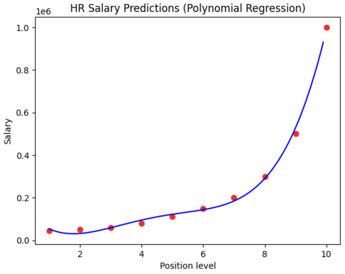
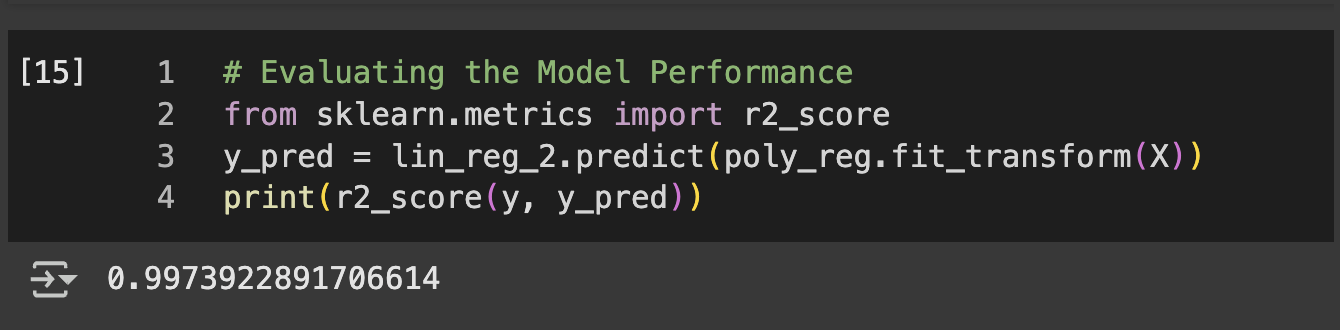
Model Visualisations: Created scatter plots with plt.scatter() for actual data points and plt.plot() for the linear regression line, showing the limitation of straight-line salary prediction. Generated similar visualizations for the polynomial model using lin_reg_2.predict(poly_reg.fit_transform(X)) to display the curved relationship between position levels and salaries.
Model comparison: Made direct salary predictions for position level 6.5 using both lin_reg.predict([[6.5]]) and lin_reg_2.predict(poly_reg.fit_transform([[6.5]])) to compare model outputs for intermediate position levels.
📊 Code Snippets & Visualisations:
# Importing Libraries
import numpy as np
import matplotlib.pyplot as plt
import pandas as pd
# Importing dataset
dataset = pd.read_csv('Position_Salaries.csv')
X = dataset.iloc[:, 1:-1].values
y = dataset.iloc[:, -1].values
# Training the Decision Tree Regression
from sklearn.tree import DecisionTreeRegressor
regressor = DecisionTreeRegressor(random_state = 0)
regressor.fit(X, y)
# Predicting New Result
regressor.predict([[6.5]])
# Visualising Results (Figure 1)
X_grid = np.arange(min(X), max(X), 0.01)
# 0.01 was adjusted from 0.1 to increase the resolution
X_grid = X_grid.reshape((len(X_grid), 1))
plt.scatter(X, y, color = 'red')
plt.plot(X_grid, regressor.predict(X_grid), color = 'blue')
plt.title('HR Salary Predictions (Decision Tree Regression)')
plt.xlabel('Position level')
plt.ylabel('Salary')
plt.show()
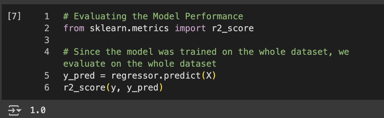
# Evaluating the Model Performance
from sklearn.metrics import r2_score
# Since the model was trained on the whole dataset, we evaluate on the whole dataset
y_pred = regressor.predict(X)
r2_score(y, y_pred)
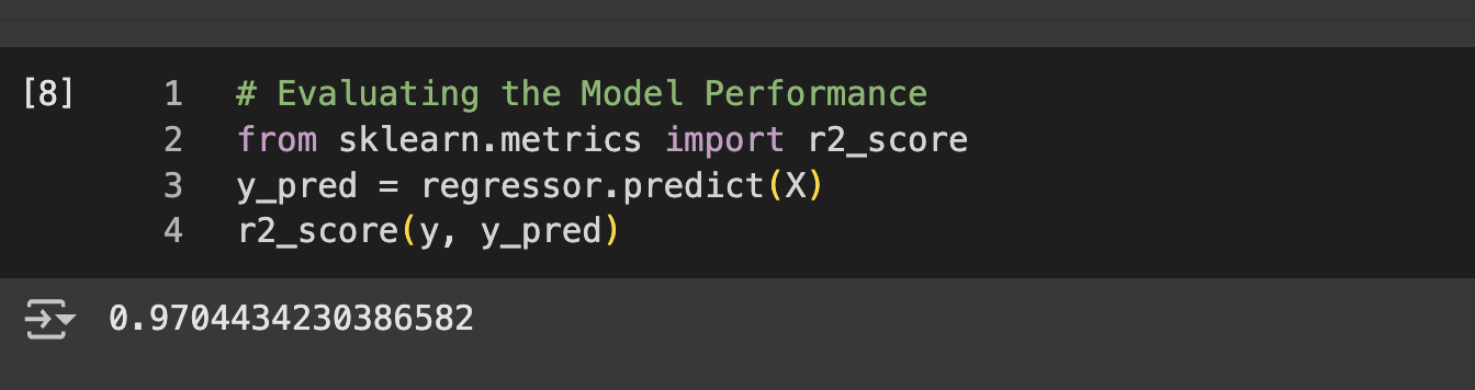
Figure 1 Linear RegressionFigure 1a Model Evaluation – Linear RegressionFigure 2 Polynomial RegressionFigure 2a Model Evaluation – Polynomial RegressionFigure 3 SVRFigure 3a Model Evaluation – SVRFigure 4 Random ForestFigure 4a Model Evaluation – Random ForestFigure 5 Decision TreeFigure 5a Model Evaluation – Decision Tree
🌟 Key Insights:
N.B: Due to small dataset there is no train-test split to avoid model overfitting
Linear regression showed limitations in capturing the exponential nature of executive compensation at higher position levels
SVR with proper scaling handled the high salary variance effectively while maintaining smooth predictions
Decision tree regression captured salary jumps at specific position levels but risked overfitting
Random forest regression provided stable predictions by averaging multiple decision trees, reducing variance
🧗🏾 Challenge Faced:
The SVR model visualization presented scaling complications because support vector regression requires feature scaling for optimal performance, but the visualization needed to display results in original salary units. The challenge was handling the forward and inverse transformations correctly. This was resolved by implementing a multi-step process: using sc_X.transform(X_grid) to scale the grid for SVR prediction, then applying sc_y.inverse_transform() to convert predictions back to actual salary values, with careful attention to array reshaping using .reshape(-1, 1) to maintain proper dimensionality throughout the scaling pipeline. This approach ensured accurate model performance while maintaining interpretable visualizations in original salary units.
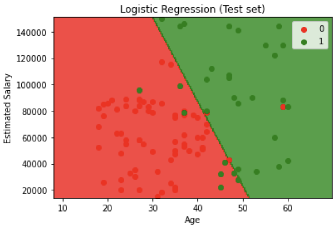
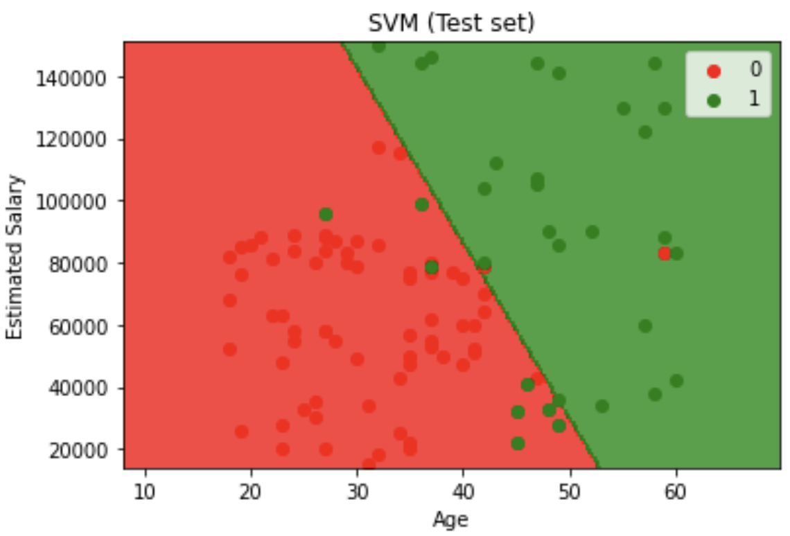
Customer Purchase Prediction – Model Comparison & Optimization
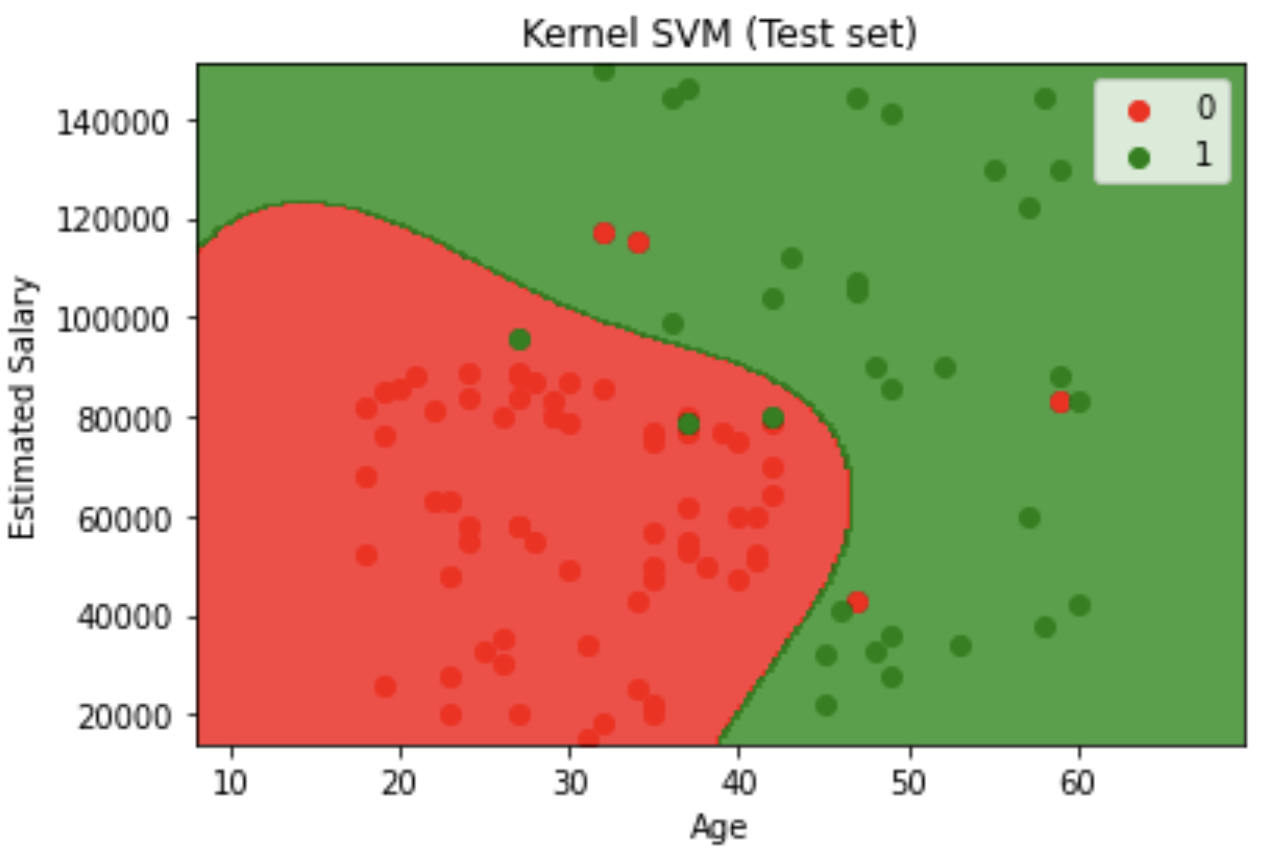
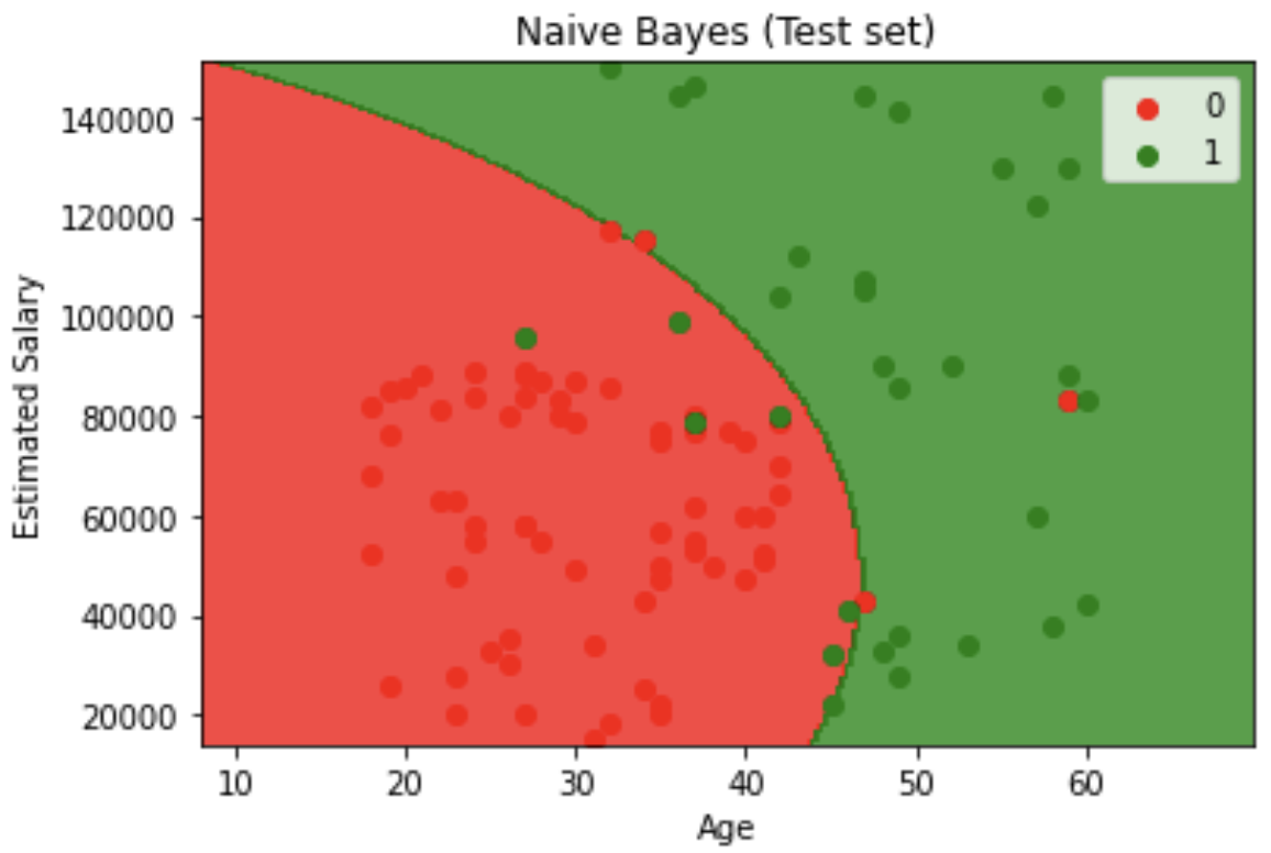
This project involved comparing multiple classification algorithms to predict whether users would purchase a product based on their age and estimated salary from social network advertisement data. I tested various models including Logistic Regression, SVM, Kernel SVM, Naive Bayes, K-NN, Random Forest, and Decision Tree. The Decision Tree classifier yielded the best results, which is why I've included its implementation in my portfolio.
💻 Tech Stack:
Python for machine learning model development and comparison
Scikit-learn for machine learning model implementation and evaluation
Pandas for dataset loading and initial data exploration
Matplotlib for creating decision boundary visualizations and scatter plots
NumPy for numerical operations and grid generation
🧪 Data Pipeline:
Model Comparison & selection: Tested multiple classification algorithms (Logistic Regression, SVM, Kernel SVM, Naive Bayes, K-NN, Random Forest, and Decision Tree) to identify the best-performing model for this dataset.
Data Import & Preparation: Loaded the Social Network Ads dataset using pandas and separated features (age, salary) from the target variable (purchase decision).
Data Splitting: Used train_test_split() to divide the dataset into 75% training and 25% testing sets with a fixed random state for reproducibility.
Feature scaling: Applied StandardScaler to normalize both age and salary features, ensuring equal contribution to the model since salary values are much larger than age values.
Model Training: Implemented and trained seven different classifiers on the scaled training data: LogisticRegression, SVC (linear and RBF kernel), GaussianNB, KNeighborsClassifier, RandomForestClassifier, and DecisionTreeClassifier with entropy criterion.
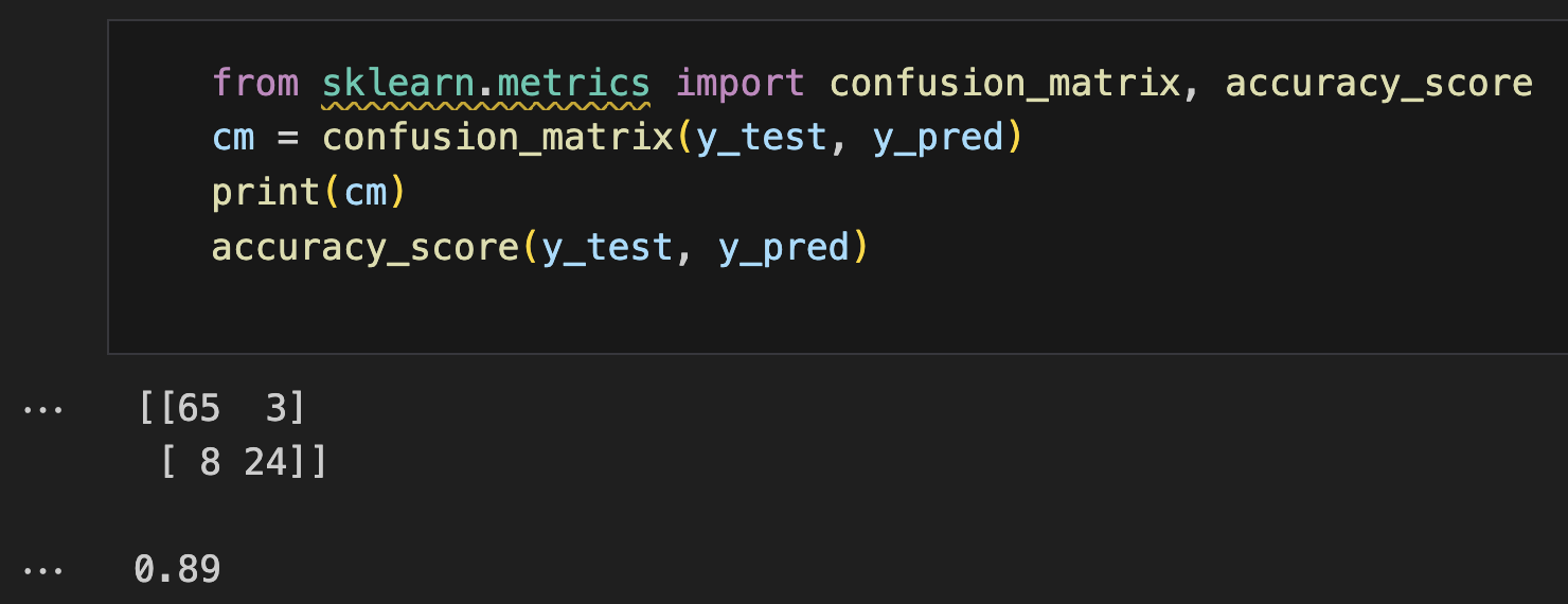
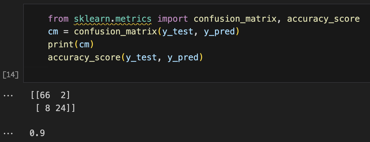
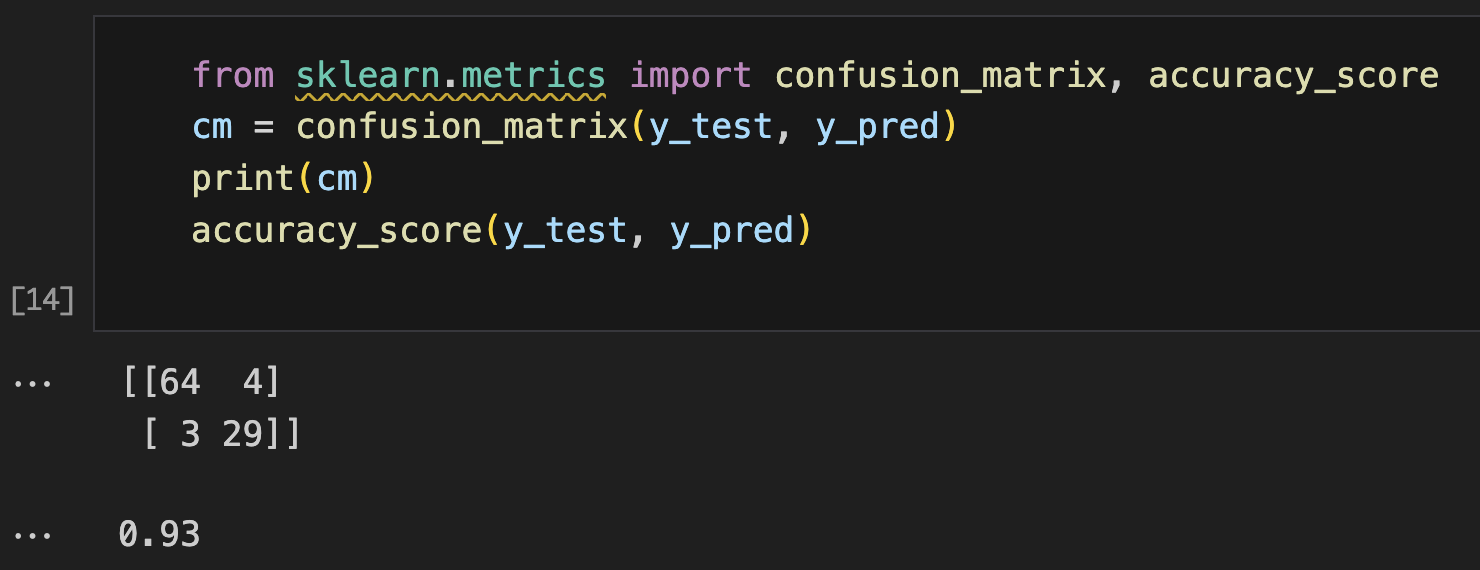
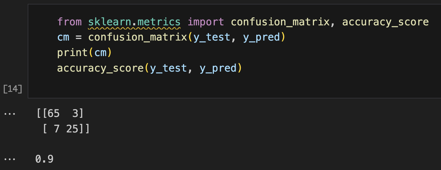
Model Evaluation: Generated predictions on the test set and created a confusion matrix to assess classification performance and calculate accuracy score..
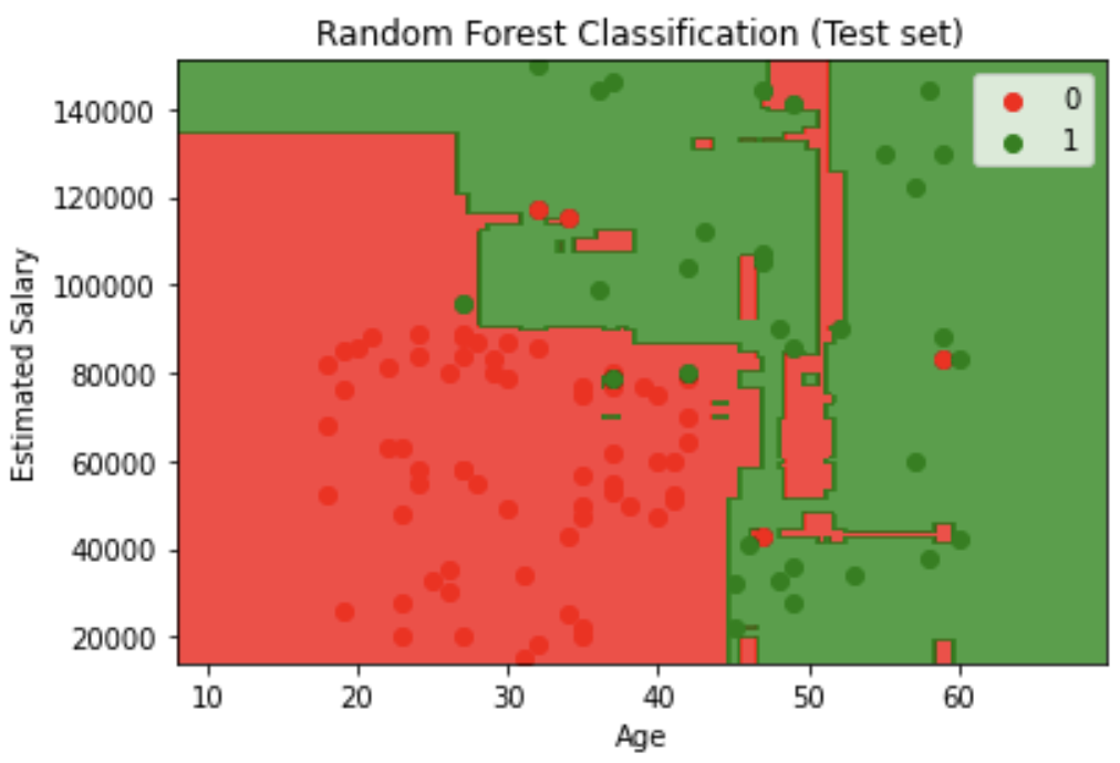
Decision Boundary Visualization feature engineering: Created contour plots showing decision boundaries for both training and test sets, with red and green regions representing different classification zones.
📊 Code Snippets & Visualisations:
# Importing Libraries
import numpy as np
import matplotlib.pyplot as plt
import pandas as pd
# Importing Dataset
dataset = pd.read_csv('Social_Network_Ads.csv')
X = dataset.iloc[:, :-1].values
y = dataset.iloc[:, -1].values
# Splitting dataset into Training & Test set
from sklearn.model_selection import train_test_split
X_train, X_test, y_train, y_test = train_test_split(X, y, test_size = 0.25, random_state = 0)
print(X_train), print(X_test)
print(y_train), print(y_test)
# Feature Scaling
from sklearn.preprocessing import StandardScaler
sc = StandardScaler()
X_train = sc.fit_transform(X_train)
X_test = sc.transform(X_test)
print(X_train), print(X_test)
# Training Decision tree classification Model
from sklearn.tree import DecisionTreeClassifier
classifier = DecisionTreeClassifier(criterion = 'entropy', random_state = 0)
classifier.fit(X_train, y_train)
# Predicting Test Results
y_pred = classifier.predict(X_test)
print(np.concatenate((y_pred.reshape(len(y_pred),1), y_test.reshape(len(y_test),1)),1))
# Making Confusion Matrix
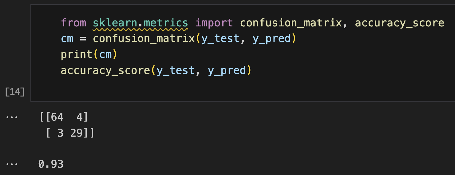
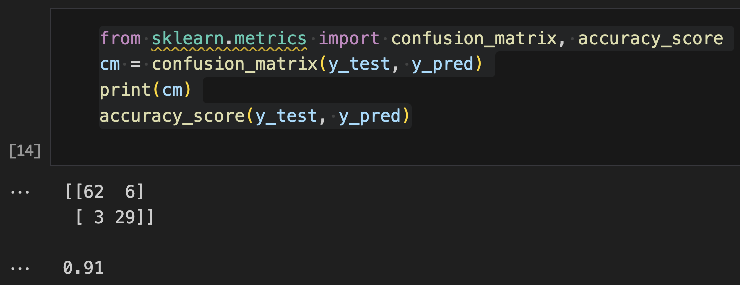
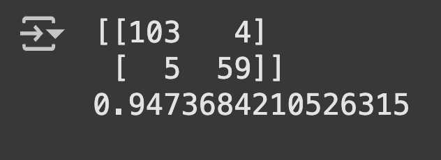
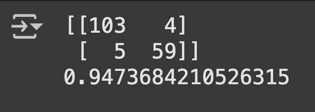
from sklearn.metrics import confusion_matrix, accuracy_score
cm = confusion_matrix(y_test, y_pred)
print(cm)
accuracy_score(y_test, y_pred)
# Visualising Training set results
from matplotlib.colors import ListedColormap
X_set, y_set = sc.inverse_transform(X_train), y_train
X1, X2 = np.meshgrid(np.arange(start = X_set[:, 0].min() - 10, stop = X_set[:, 0].max() + 10, step = 0.25),
np.arange(start = X_set[:, 1].min() - 1000, stop = X_set[:, 1].max() + 1000, step = 0.25))
plt.contourf(X1, X2, classifier.predict(sc.transform(np.array([X1.ravel(), X2.ravel()]).T)).reshape(X1.shape),
alpha = 0.75, cmap = ListedColormap(('red', 'green')))
plt.xlim(X1.min(), X1.max())
plt.ylim(X2.min(), X2.max())
for i, j in enumerate(np.unique(y_set)):
plt.scatter(X_set[y_set == j, 0], X_set[y_set == j, 1], c = ListedColormap(('red', 'green'))(i), label = j)
plt.title('Decision Tree Classification (Training set)')
plt.xlabel('Age')
plt.ylabel('Estimated Salary')
plt.legend()
plt.show()
# Visualising Test set results
from matplotlib.colors import ListedColormap
X_set, y_set = sc.inverse_transform(X_test), y_test
X1, X2 = np.meshgrid(np.arange(start = X_set[:, 0].min() - 10, stop = X_set[:, 0].max() + 10, step = 0.25),
np.arange(start = X_set[:, 1].min() - 1000, stop = X_set[:, 1].max() + 1000, step = 0.25))
plt.contourf(X1, X2, classifier.predict(sc.transform(np.array([X1.ravel(), X2.ravel()]).T)).reshape(X1.shape),
alpha = 0.75, cmap = ListedColormap(('red', 'green')))
plt.xlim(X1.min(), X1.max())
plt.ylim(X2.min(), X2.max())
for i, j in enumerate(np.unique(y_set)):
plt.scatter(X_set[y_set == j, 0], X_set[y_set == j, 1], c = ListedColormap(('red', 'green'))(i), label = j)
plt.title('Decision Tree Classification (Test set)')
plt.xlabel('Age')
plt.ylabel('Estimated Salary')
plt.legend()
plt.show()
Decision Tree outperformed six other classification models including Logistic Regression, SVM variants, Naive Bayes, K-NN, and Random Forest, demonstrating superior accuracy for this specific age-salary prediction task
Feature scaling significantly improved model performance across all algorithms by preventing salary values from dominating the decision-making process due to their larger magnitude compared to age values
Visual analysis revealed clear classification patterns where younger, lower-salary individuals and older, higher-salary individuals showed different purchasing behaviors, with the winning Decision Tree model capturing these complex relationships most effectively
🧗🏾 Challenge Faced:
At first, the visualisations were hard to understand because the data had been scaled. The age and salary values didn’t look realistic in the plots. I solved this by converting the data back to its original scale before plotting. This made the decision areas easier to read and relate to real-life values.
Breast Cancer Classification: Multi-Algorithm Comparison
This project implemented and compared six different machine learning classification algorithms to predict breast cancer diagnosis (malignant vs benign) based on cellular characteristics. I built a comprehensive medical classification pipeline using multiple algorithms to identify the most effective approach for cancer detection and diagnosis support.
💻 Tech Stack:
Python for machine learning model development and comparison
Scikit-learn for multiple classification algorithms, preprocessing, and evaluation metrics
Pandas for dataset loading and initial data exploration
Matplotlib for data visualisationsand model performance analysis
NumPy for numerical operations and grid generation
🧪 Data Pipeline:
Load & inspect data: Loaded breast cancer dataset using pd.read_csv() and separated cellular features (X) from diagnosis labels (y) using iloc[:, :-1] and iloc[:, -1] respectively, ensuring proper handling of medical diagnostic data.
Train-test stratification: Applied train_test_split() with 75-25 split (test_size=0.25) and fixed random state for reproducible medical model evaluation, crucial for healthcare applications.
Feature standardization: Implemented StandardScaler() using fit_transform() on training data and transform() on test data to normalize cellular measurements across different scales without data leakage.
Logistic Regression: Built a LogisticRegression(random_state=0) model as the statistical baseline for binary medical classification, providing interpretable probability outputs for clinical decision-making.
Support Vector Machine (Linear): Implemented SVC(kernel='linear') to find optimal linear decision boundaries for separating malignant from benign cases using maximum margin principles.
Decision Tree Classification: Applied DecisionTreeClassifier(criterion='entropy') to create interpretable rule-based diagnostic pathways that clinicians can follow and understand.
K-Nearest Neighbors: Used KNeighborsClassifier(n_neighbors=5, metric='minkowski', p=2) to classify cases based on similarity to neighboring data points, leveraging local patterns in cellular characteristics.
Support Vector Machine (RBF): Implemented SVC(kernel='rbf') with radial basis function kernel to capture complex non-linear relationships in cellular feature space.
Naive Bayes: Applied GaussianNB() assuming feature independence to provide probabilistic classification based on Bayesian statistics, suitable for medical diagnostic scenarios.
Performance evaluation: Generated predictions using classifier.predict(X_test) and evaluated each model using confusion_matrix() and accuracy_score() to assess diagnostic accuracy and error patterns.
Medical model validation: Created confusion matrices to analyze true positives, false positives, true negatives, and false negatives - critical metrics for medical diagnostic applications where false negatives (missed cancers) are particularly concerning..
📊 Code Snippets & Visualisations:
# Importing the libraries
import numpy as np
import matplotlib.pyplot as plt
import pandas as pd
# Importing the dataset
dataset = pd.read_csv('Breast cancer data.csv')
X = dataset.iloc[:, :-1].values
y = dataset.iloc[:, -1].values
# Splitting the dataset into the Training set and Test set
from sklearn.model_selection import train_test_split
X_train, X_test, y_train, y_test = train_test_split(X, y, test_size = 0.25, random_state = 0)
# Feature Scaling
from sklearn.preprocessing import StandardScaler
sc = StandardScaler()
X_train = sc.fit_transform(X_train)
X_test = sc.transform(X_test)
# Training Model on the Training set
from sklearn.tree import DecisionTreeClassifier
classifier = DecisionTreeClassifier(criterion = 'entropy', random_state = 0)
classifier.fit(X_train, y_train)
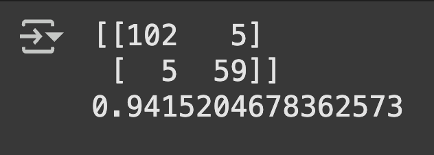
# Evaluating using confusion matrix
from sklearn.metrics import confusion_matrix, accuracy_score
y_pred = classifier.predict(X_test)
cm = confusion_matrix(y_test, y_pred)
print(cm)
accuracy_score(y_test, y_pred)
Multiple algorithms provided different approaches to cancer classification, each with unique strengths for medical diagnosis
Feature standardization proved crucial for distance-based algorithms (SVM, KNN) due to varying scales of cellular measurements
Confusion matrix analysis revealed the trade-offs between sensitivity (detecting cancer) and specificity (avoiding false alarms)
Model comparison enabled selection of the most reliable algorithm for medical diagnostic support
🧗🏾 Challenge Faced:
Working with medical diagnostic data presented a critical class imbalance consideration that required careful attention to evaluation metrics beyond simple accuracy. While accuracy score provides an overall performance measure, it can be misleading in medical contexts where false negatives (missing actual cancer cases) have far more severe consequences than false positives (flagging benign cases as suspicious). The challenge was ensuring that model evaluation properly weighted the clinical importance of sensitivity (recall) versus specificity, as a model with 95% accuracy might still miss 20% of actual cancer cases if the dataset is imbalanced. This was addressed by implementing confusion matrix analysis to examine true positives, false positives, true negatives, and false negatives separately, enabling assessment of each model's ability to minimize the most clinically dangerous errors while maintaining overall diagnostic reliability.
Analyzed bank customer data to segment customers using K-Means Clustering, with dimensionality reduction achieved through PCA. This approach resulted in 7 well-defined customer segments based on key financial behaviors, optimizing the bank's ability to market tailored products and services to their customers.
💻 Tech Stack:
Python for machine learning model development and comparison
Scikit-learn for Clustering (KMeans) and PCA
Pandas for data manipulation
Seaborn for for data visualisation
Matplotlib for data visualisation and model performance analysis
🧪 Data Pipeline:
Load & inspect data: Loaded the dataset using pd.read_csv(), checked for nulls and reviewed data types using .info() and .describe().
Exploratory Analysis: Removed customer ID column. Handled missing values, especially in MINIMUM_PAYMENTS and CREDIT_LIMIT. Used pair plots and distribution plots to understand feature distributions and detect outliers.
Feature selection & scaling: Selected numerical columns (like Age, Income, Spending Score) and scaled them using StandardScaler for optimal clustering.
Clustering wiht KMeans: Applied the Elbow Method to determine the optimal number of clusters and used KMeans to group customers.
Visualisation: Plotted clusters using PCA components. Created scatter plots with cluster labels to visualise customer groupings based on income and spending behaviour.
📊 Code Snippets & Visualisations:
# Importing the libraries
import pandas as pd
import numpy as np
import matplotlib.pyplot as plt
import seaborn as sns
from sklearn.preprocessing import StandardScaler
from sklearn.cluster import KMeans
from sklearn.decomposition import PCA
from sklearn.tree import DecisionTreeClassifier
from sklearn.metrics import confusion_matrix, accuracy_score
# Load the data
credit_card_df = pd.read_csv('/content/4.+Marketing_data.csv')
credit_card_df.info()
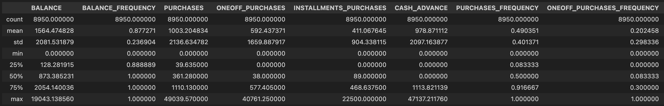
# Display descriptive statistics (Table 1)
credit_card_df.describe()
# Comments from analysis:
# - Mean balance is $1564
# - Balance frequency is frequently updated on average ~0.9, Purchases average is $1000, one off purchase average is ~$600
# - Average purchases frequency is around 0.5, Average ONEOFF_PURCHASES_FREQUENCY, PURCHASES_INSTALLMENTS_FREQUENCY, and CASH_ADVANCE_FREQUENCY are generally low
# - Average credit limit ~ 4500, Percent of full payment is 15%, Average tenure is 11 years
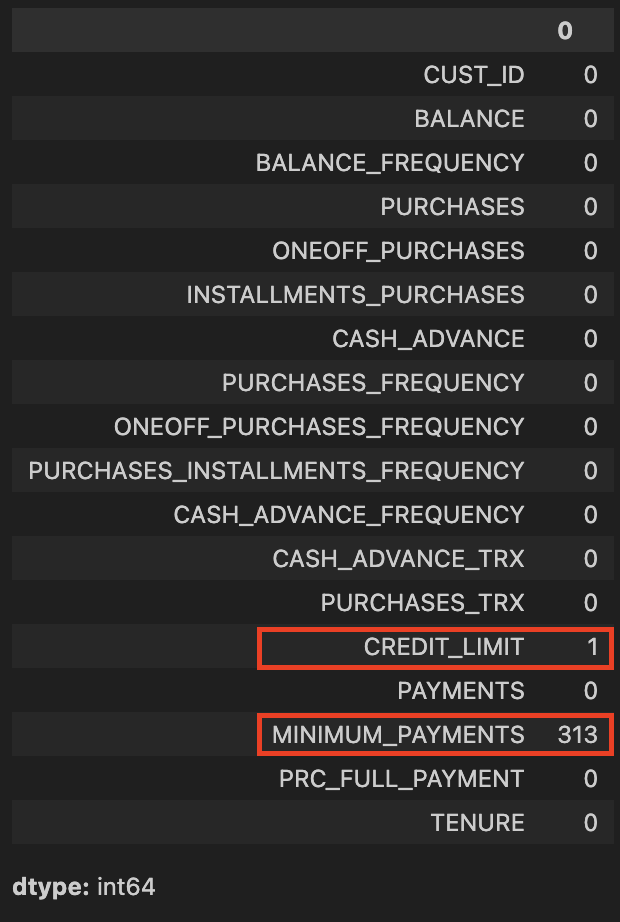
# Check for missing data (Table 2)
credit_card_df.isnull().sum()
# Replace the missing elements with mean of the 'MINIMUM_PAYMENT'
credit_card_df.MINIMUM_PAYMENTS.fillna(credit_card_df.MINIMUM_PAYMENTS.mean(), inplace=True)
# Replace the missing elements with mean of the 'CREDIT_LIMIT'
credit_card_df.CREDIT_LIMIT.fillna(credit_card_df.CREDIT_LIMIT.mean(), inplace=True)
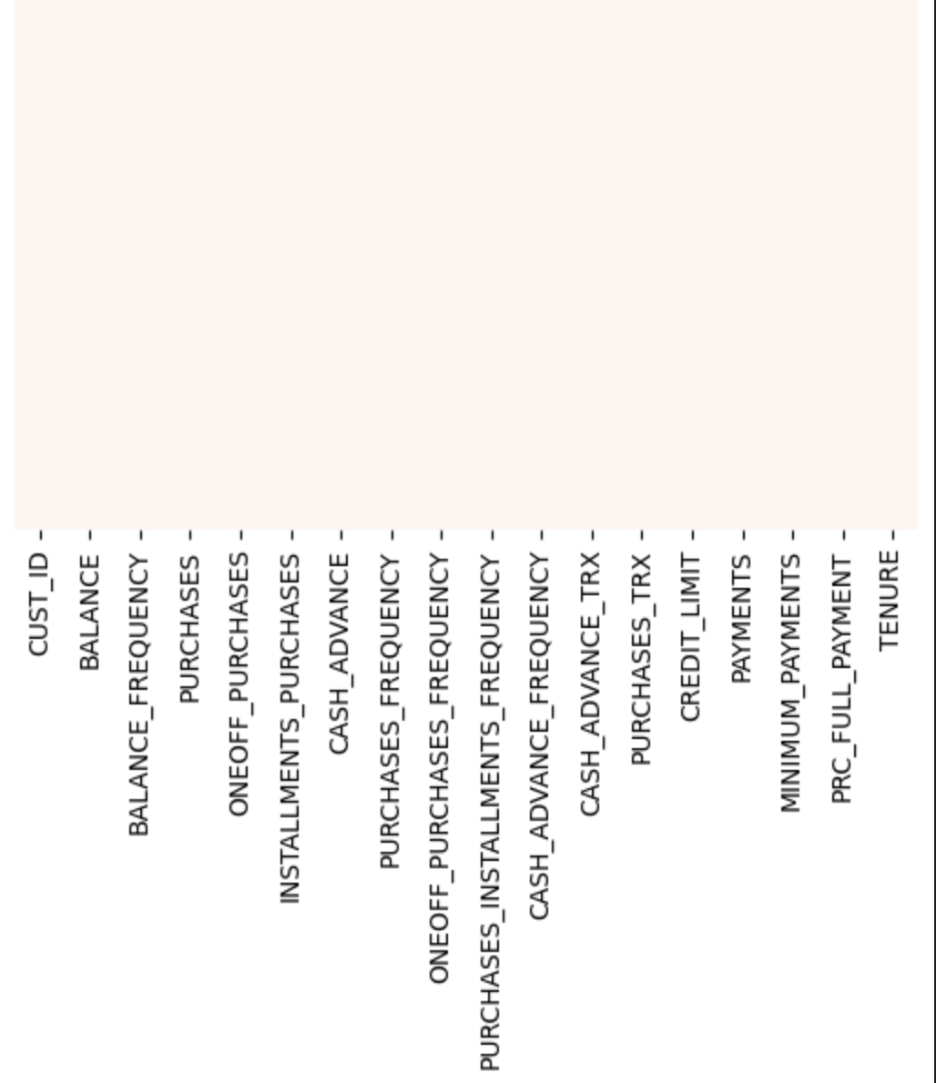
# Plot to check for missing data (Figure 1)
sns.heatmap(credit_card_df.isnull(), yticklabels=False, cbar=False, cmap='Reds')
# Check for duplicate entries
credit_card_df.duplicated().sum()
# Remove Customer ID
credit_card_df.drop('CUST_ID', axis=1, inplace=True)
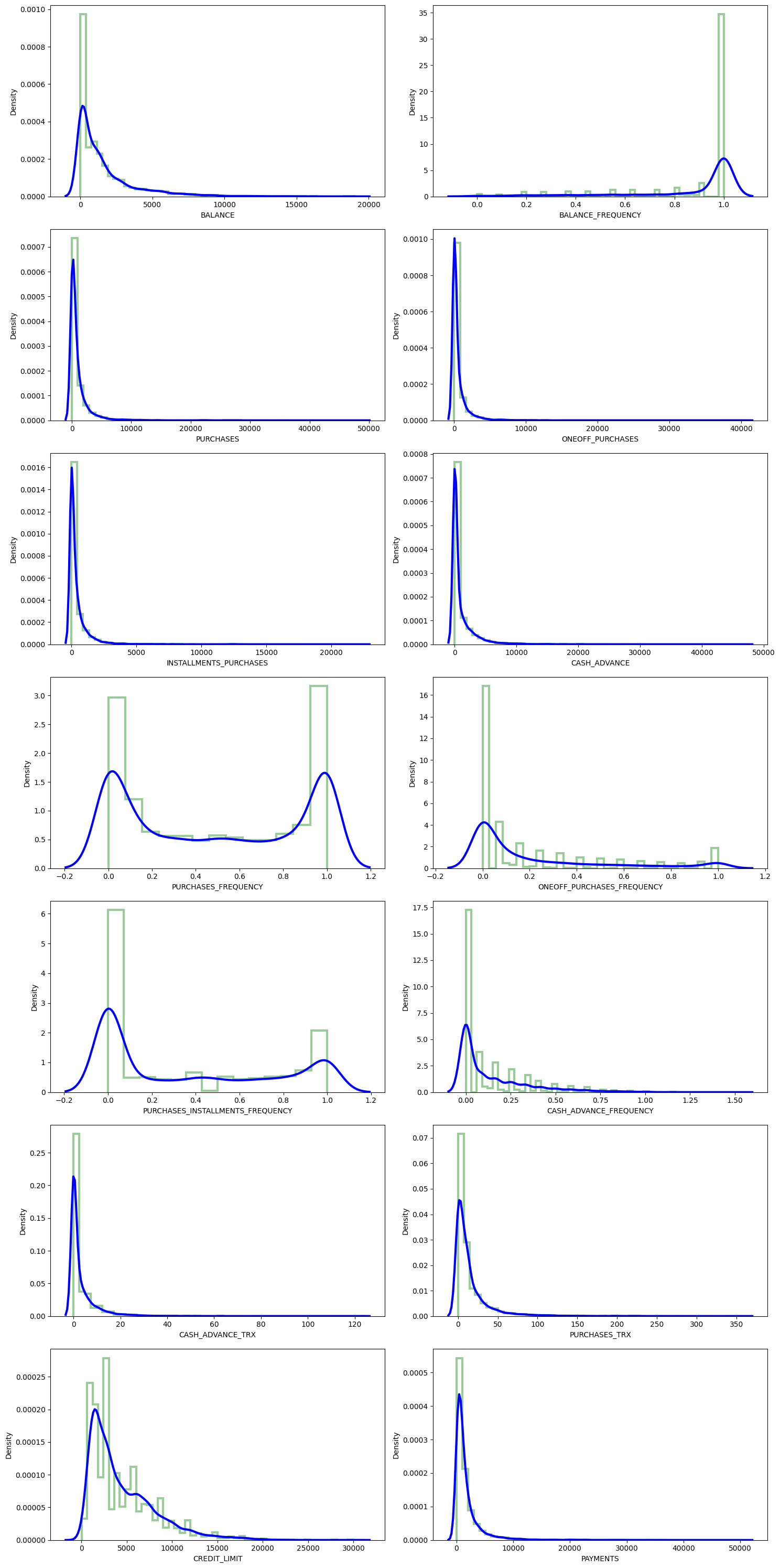
# Define function to create subplots of distplots with KDE for all columns
def dist_plots(dataframe):
fig, ax = plt.subplots(nrows=7, ncols=2, figsize=(15, 30))
index = 0
for row in range(7):
for col in range(2):
if index < dataframe.shape[1]: # Added safety check
sns.distplot(dataframe.iloc[:, index], ax=ax[row][col],
kde_kws={'color': 'blue', 'lw': 3, 'label': 'KDE'},
hist_kws={'histtype': 'step', 'lw': 3, 'color': 'green'})
index += 1
plt.tight_layout()
plt.show()
# Visualise distplots (Figure 2)
dist_plots(credit_card_df)
# Analysis comments:
# - 'Balance_Frequency' for most customers is updated frequently ~1, For 'PURCHASES_FREQUENCY', there are two distinct group of customers
# - For 'ONEOFF_PURCHASES_FREQUENCY' and 'PURCHASES_INSTALLMENT_FREQUENCY' most users don't do one off purchases or installment purchases frequently, Very small number of customers pay their balance in full 'PRC_FULL_PAYMENT'~0
# - Mean of balance is $1500, Credit limit average is around $4500, Most customers are ~11 years tenure
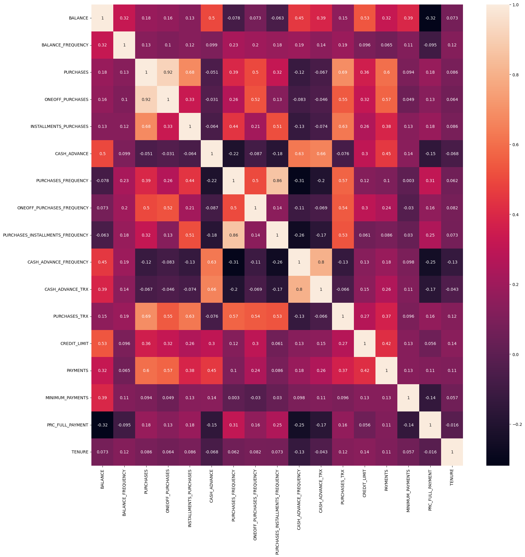
# Heatmap to visualise correlations (Figure 3)
correlations = credit_card_df.corr()
plt.figure(figsize=(20, 20))
sns.heatmap(correlations, annot=True)
# Analysis comments:
# - 'PURCHASES' have high correlation between one-off purchases, 'installment purchases, purchase transactions, credit limit and payments.
# - Strong Positive Correlation between 'PURCHASES_FREQUENCY' and 'PURCHASES_INSTALLMENT_FREQUENCY'
# Note: The following section appears to be for classification, but X_train, X_test, y_train, y_test are not defined
# You may need to add train_test_split and define your features and target variable
# Training Model on the Training set
# classifier = DecisionTreeClassifier(criterion='entropy', random_state=0)
# classifier.fit(X_train, y_train)
# Evaluating using confusion matrix
# y_pred = classifier.predict(X_test)
# cm = confusion_matrix(y_test, y_pred)
# print(cm)
# accuracy_score(y_test, y_pred)
# Display first few rows
credit_card_df.head()
# Apply Feature scaling
scaler = StandardScaler()
credit_card_df_scaled = scaler.fit_transform(credit_card_df)
# Display scaled data
print(credit_card_df_scaled)
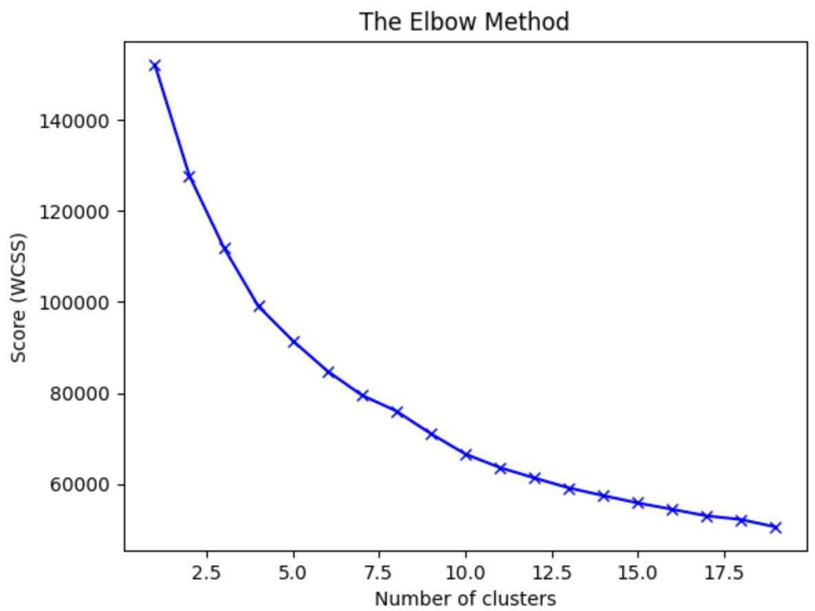
# Use Elbow Method to find optimal number of clusters (Figure 4)
wcss = []
for i in range(1, 20):
kmeans = KMeans(n_clusters=i, init='k-means++', random_state=42)
kmeans.fit(credit_card_df_scaled)
wcss.append(kmeans.inertia_)
plt.plot(range(1, 20), wcss, 'bx-')
plt.title('The Elbow Method')
plt.xlabel('Number of clusters')
plt.ylabel('Score (WCSS)')
plt.show()
# Analysis comment:
# We can observe that, 4th cluster seems to be forming the elbow of the curve. However, the values does not reduce linearly until 8th cluster. Let's choose the number of clusters to be 7.
# Train data using K-Means method with 7 clusters
kmeans = KMeans(n_clusters=7, init='k-means++', random_state=42)
kmeans.fit(credit_card_df_scaled)
labels = kmeans.labels_
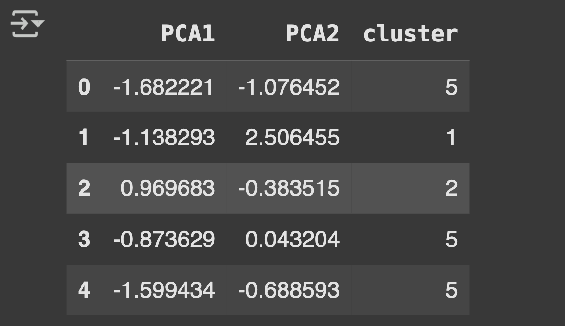
# Use Principal Component Analysis to reduce dimensionality
pca = PCA(n_components=2)
principalComp = pca.fit_transform(credit_card_df_scaled)
print(principalComp)
# Create a dataframe with the two components
pca_df = pd.DataFrame(data=principalComp, columns=['PCA1', 'PCA2'])
print(pca_df)
# Concatenate the clusters labels to the dataframe (Table 3)
pca_df = pd.concat([pca_df, pd.DataFrame({'cluster': labels})], axis=1)
pca_df.head()
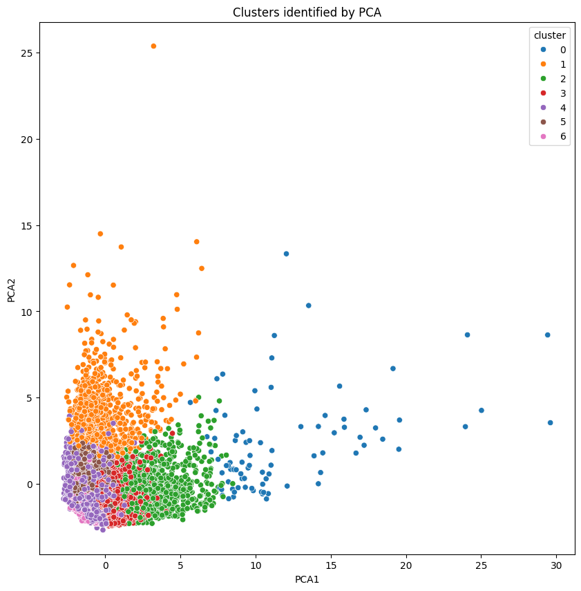
# Visualise Clusters (Figure 5)
plt.figure(figsize=(10, 10))
ax = sns.scatterplot(x='PCA1', y='PCA2', hue='cluster', data=pca_df, palette='tab10')
plt.title('Clusters identified by PCA')
plt.show()
Table 1 Customer Data FrameTable 2 Missing Data AnalysisFigure 1 Data Completeness VerificationFigure 2 Feature Distribution AnalysisFigure 3 Feature Correlation HeatmapFigure 4 Optimal Cluster DeterminationTable 3 PCA Component AnalysisFigure 5 Customer Cluster Visualization
🌟 Key Insights:
High income earners tend to be low spenders and Low income earners tend to be high spenders
Customer spending behaviour is strongly differentiated by frequency of purchases and reliance on cash advances. Some customer groups showed heavy instalment purchases but minimal one-off spending, revealing clear segmentation potential for tailored credit card offers.
🧗🏾 Challenge Faced:
Initial visualisations of K-Means clusters were ambiguous due to the high dimensionality of features. Reducing dimensions with PCA made it easier to see meaningful separation, but it required balancing between retaining variance and simplifying complexity. I resolved this by examining explained variance ratios and adjusting the number of components accordingly.
This project focused on predicting future stock prices using historical data and Ridge Regression, comparing its performance to other models. I used Python and integrated both traditional machine learning and visualisation libraries to explore the data and build predictive models. Achieved an R-squared score of 98%, with a k-fold cross-validation score of 86%.
💻 Tech Stack:
Python for machine learning model development and comparison
Scikit-learn for rideg regression model and evaluation and evaluation metrics
Pandas for dataset loading and initial data exploration
Matplotlib for data visualisationsand model performance analysis
NumPy for numerical operations and grid generation
Matplotlib for static visualisations
Plotly for interactive charts and dashboards
TensorFlow/Keras for for experimenting with neural models
🧪 Data Pipeline:
Load & inspect data: Loaded historical stock price and volume data from CSV files. Visualised trends in stock prices and volumes using line and distribution plots.
Preprocessing: Cleaned and aligned datasets by timestampse. Normalised features and created lag-based features for time series modelling.
Model Development: Applied Ridge Regression to reduce overfitting from correlated features. Split dataset into training and testing sets using train_test_split().
Performance comparison: Evaluated models using r2_score.
Visualisation: Plotted predicted vs actual stock prices to interpret model behaviour.
📊 Code Snippets & Visualisations:
# Importing the libraries
import pandas as pd
import plotly.express as px
from copy import copy
from scipy import stats
import matplotlib.pyplot as plt
import numpy as np
import plotly.figure_factory as ff
from sklearn.linear_model import LinearRegression
from sklearn.svm import SVR
from sklearn.model_selection import train_test_split
from sklearn.metrics import r2_score
from sklearn.preprocessing import MinMaxScaler
from sklearn.linear_model import Ridge
from sklearn.model_selection import cross_val_score
# Get stock prices dataframe info
stock_price_df.info()
# Get stock volume dataframe info
stock_vol_df.info()
stock_vol_df.describe()
# Function to normalize stock prices based on their initial price (Figure 1)
def normalize(df):
x = df.copy()
for i in x.columns[1:]:
x[i] = x[i] / x[i][0]
return x
# Function to plot interactive plots using Plotly Express (Figure 2)
def interactive_plot(df, title):
fig = px.line(title=title)
for i in df.columns[1:]:
fig.add_scatter(x=df['Date'], y=df[i], name=i)
fig.show()
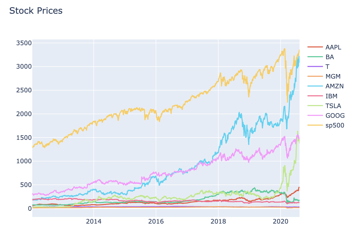
# Interactive chart for stocks Prices data (Figure 1)
interactive_plot(stock_price_df, 'Stock Prices')
# Normalised chart for stocks Prices data (Figure 2)
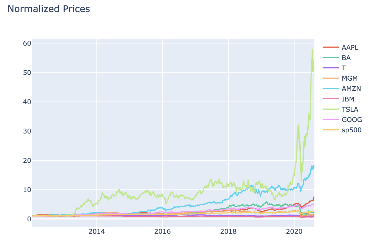
interactive_plot(normalize(stock_price_df), 'Normalized Prices')
# Interactive chart for stocks Volume data (Figure 3)
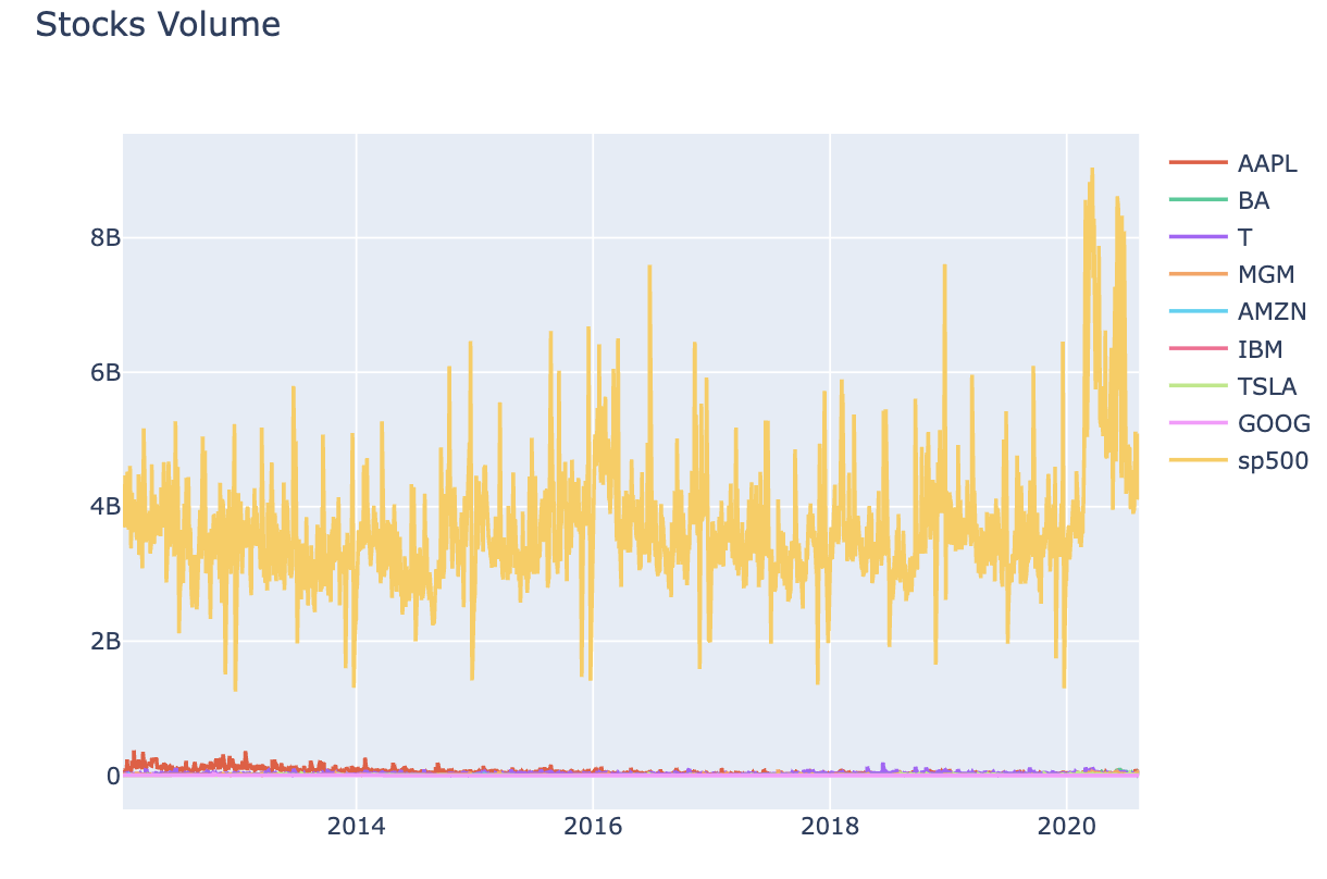
interactive_plot(stock_vol_df, 'Stocks Volume')
# Normalised chart for stocks volume data (Figure 4)
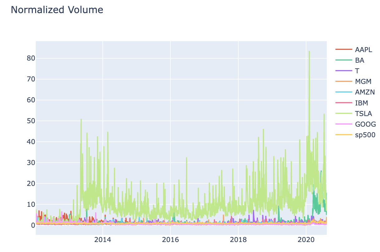
interactive_plot(normalize(stock_vol_df), 'Normalized Volume')
# Prepare Data before training Regression model
# Function to concatenate the date, stock price, and volume in one dataframe
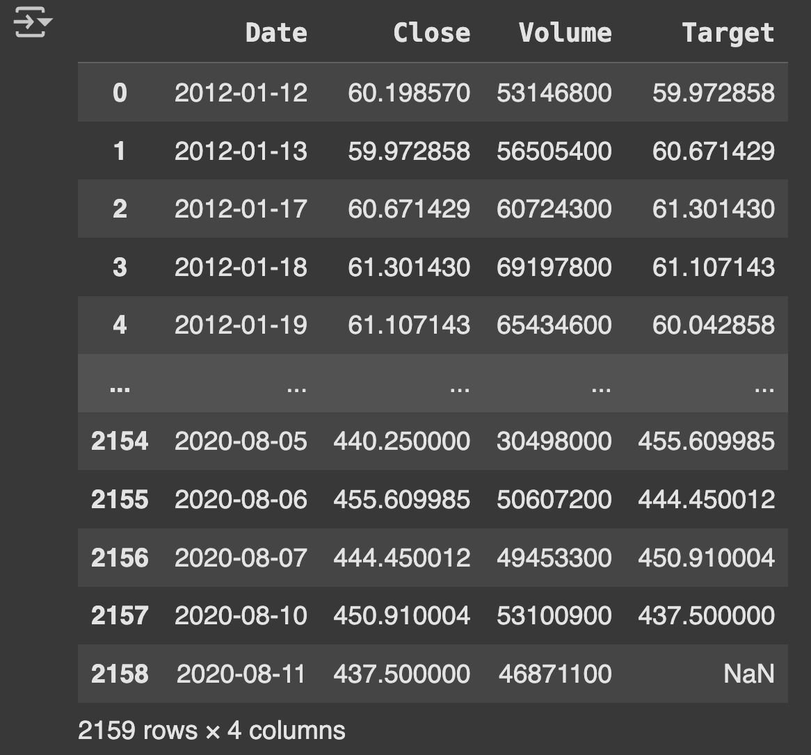
def individual_stock(price_df, vol_df, name):
return pd.DataFrame({
'Date': price_df['Date'],
'Close': price_df[name],
'Volume': vol_df[name]
})
# Function to return the output (target) data ML Model [Target stock price today will be tomorrow's price]
def trading_window(data):
n = 1 # 1 day window
# Create a column containing the prices for the next 1 days
data['Target'] = data[['Close']].shift(-n)
return data
# Test concatenation function using individual stock
price_volume_df = individual_stock(stock_price_df, stock_vol_df, 'AAPL')
print(price_volume_df)
# Test trading window function using concatenated df (Table 1)
price_volume_target_df = trading_window(price_volume_df)
print(price_volume_target_df)
# Apply Feature Scaling to data
sc = MinMaxScaler(feature_range=(0, 1))
price_volume_target_scaled_df = sc.fit_transform(price_volume_target_df.drop(columns=['Date']))
# Creating Feature and Target
X = price_volume_target_scaled_df[:, :2]
y = price_volume_target_scaled_df[:, 2:]
# Converting dataframe to arrays
X = np.asarray(X)
y = np.asarray(y)
print("X shape:", X.shape, "y shape:", y.shape)
# Splitting the data this way, since order is important in time-series
split = int(0.80 * len(X))
X_train = X[:split]
y_train = y[:split]
X_test = X[split:]
y_test = y[split:]
# Define a data plotting function (Figure 5)
def show_plot(data, title):
plt.figure(figsize=(13, 5))
plt.plot(data, linewidth=3)
plt.title(title)
plt.grid()
plt.legend(['Feature 1', 'Feature 2'])
plt.show()
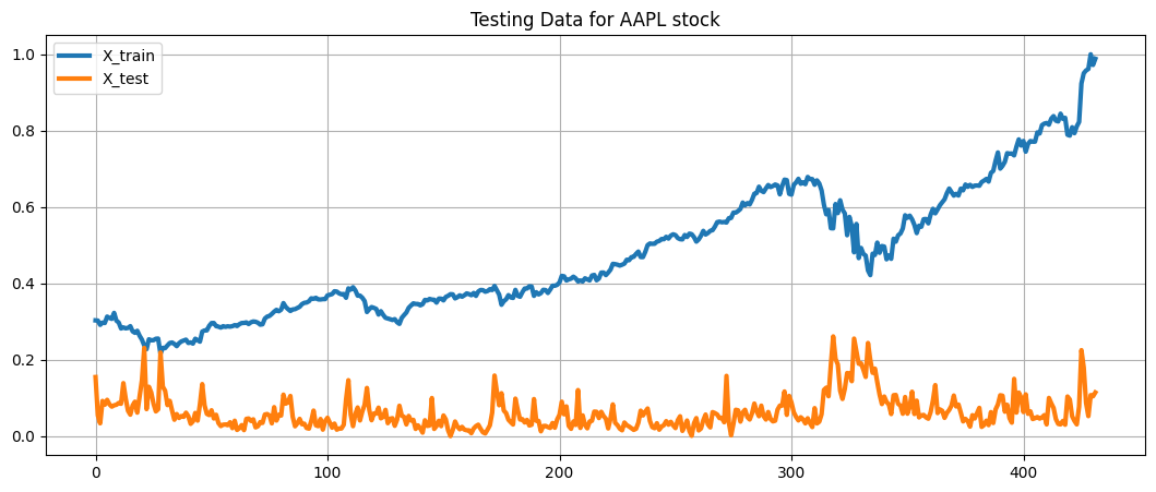
show_plot(X_train, 'Training Data for AAPL stock')
show_plot(X_test, 'Testing Data for AAPL stock')
# Build & Train Ridge Regression model
# This model was chosen to get a generalised trend for data (avoids over fitting) - expected low testing accuracy expected.
# Note that Ridge regression performs linear least squares with L2 regularization.
regression_model = Ridge()
regression_model.fit(X_train, y_train)
# Test the model and calculate its accuracy
ridge_accuracy = regression_model.score(X_test, y_test)
print("Ridge Regression Score: ", ridge_accuracy)
# Make predictions
predicted_prices = regression_model.predict(X_test)
# K-Fold Cross validation Score
accuracies = cross_val_score(estimator=regression_model, X=X_train, y=y_train, cv=10)
print("Accuracy: {:.2f} %".format(accuracies.mean() * 100))
print("Standard Deviation: {:.2f} %".format(accuracies.std() * 100))
# Example output comment:
# Accuracy: 86.27%
# Standard Deviation: 11.01 %
# Append the predicted values into a list
predicted = []
for i in predicted_prices:
predicted.append(i[0])
# Append the close values to the list (using actual test data)
close = []
for i in range(len(X_test)):
close.append(price_volume_target_scaled_df[split + i][0]) # Close prices from test set
# Create a dataframe based on the dates in the individual stock data
df_predicted = price_volume_target_df[['Date']].iloc[split:split + len(predicted)].copy()
# Function to add the close and predicted values to the dataframe
def add_predicted_and_close(df, close, predicted):
df['Close'] = close
df['Prediction'] = predicted
return df
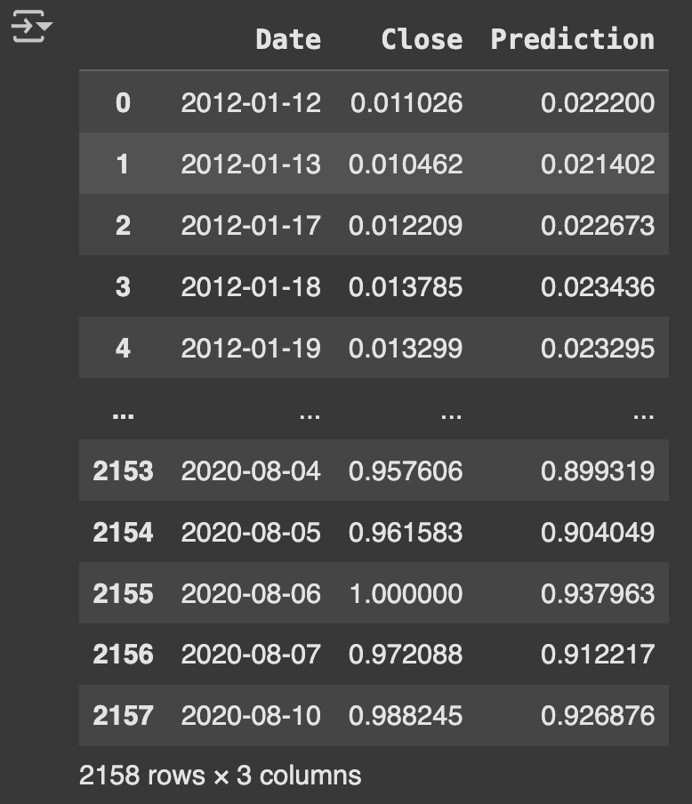
# Apply the function (Table 2)
df_predicted = add_predicted_and_close(df_predicted, close, predicted)
print(df_predicted)
# Define interactive plot (Figure 6 & 7)
def interactive_plot_predictions(df, title):
fig = px.line(df, title=title, x='Date', y=['Close', 'Prediction'])
fig.show()
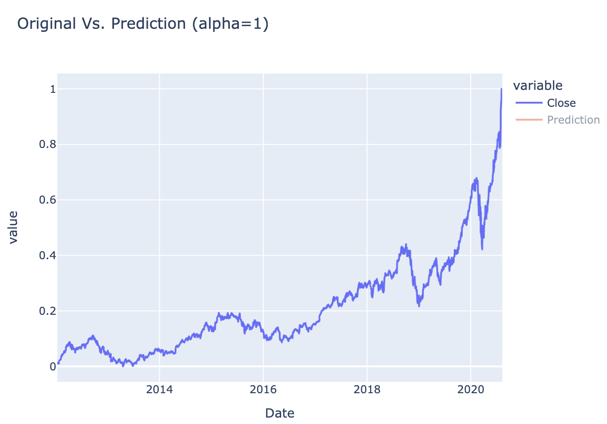
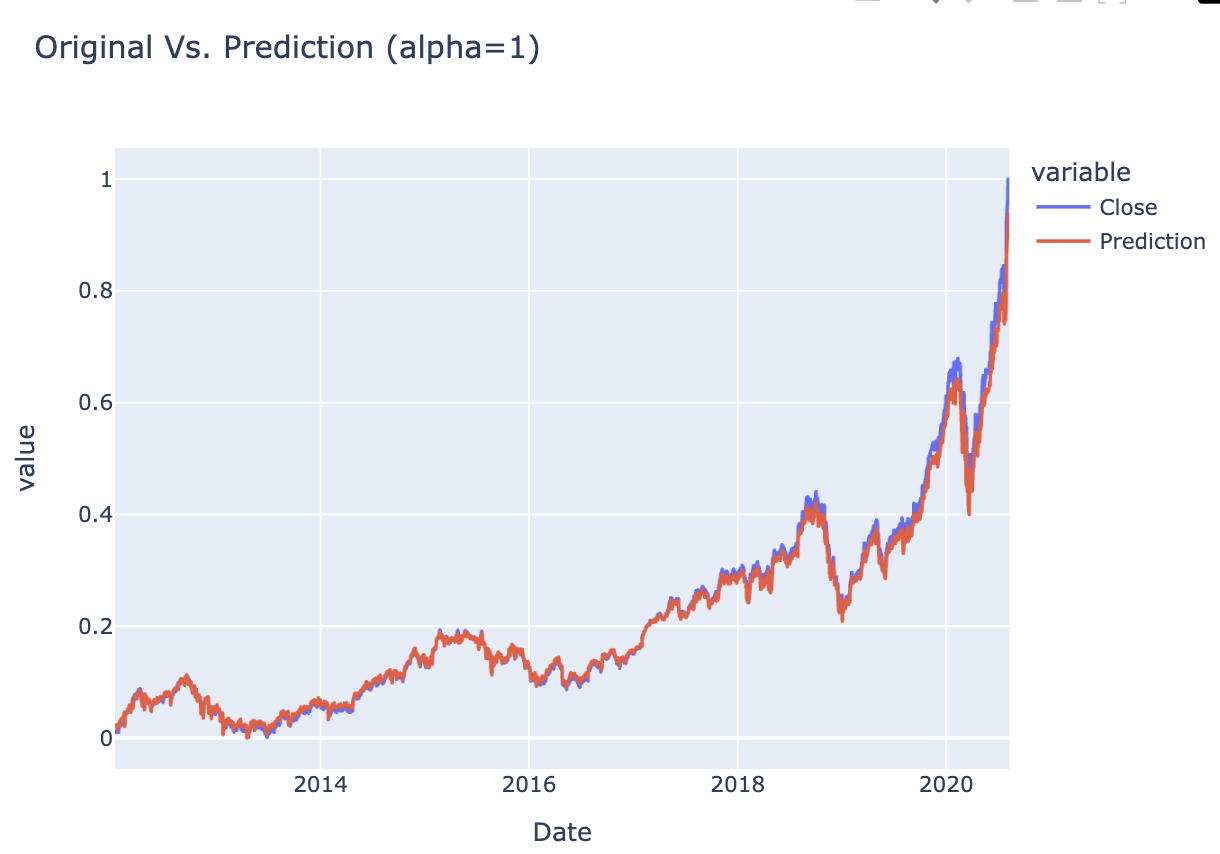
# Plot the results
interactive_plot_predictions(df_predicted, "Original Vs. Prediction (alpha=1)")
Figure 1 Stock PricesFigure 2 Stock Prices - NormalisedFigure 3 Stock VolumesFigure 4 Stock Volumes - NormalisedTable 1 Price Volume DataFigure 5 Training & Test DataTable 2 Closing & Predicted ValuesFigure 6 Random Forest AnalysisFigure 7 Decision Tree Analysis
🌟 Key Insights:
Ridge Regression outperformed Linear Regression in terms of stability and generalisation, especially when features had multicollinearity. The regularisation strength helped in handling noisy financial indicators.
🧗🏾 Challenge Faced:
Feature engineering for time series prediction was a significant challenge. Initially, using raw historical prices didn’t yield strong predictive accuracy. After adding lagged variables and scaling features, the model performance improved. It required careful experimentation to balance information richness and model simplicity.
Stock Price Analysis using Long Short Term Memory Neural Network
This project focused on predicting Tesla (TSLA) stock prices using deep learning techniques with LSTM neural networks. I built a time series forecasting model that uses historical closing prices and trading volumes to predict next-day stock prices, implementing robust validation through K-fold cross-validation.
💻 Tech Stack:
Python for machine learning model development and comparison
Scikit-learn for data scaling, train-test splits, and cross-validations
NumPy for numerical operations and grid generation
Pandas for dataset loading and initial data exploration
Matplotlib for data visualisations and model performance analysis
TensorFlow/Keras for building and training LSTM neural networks
🧪 Data Pipeline:
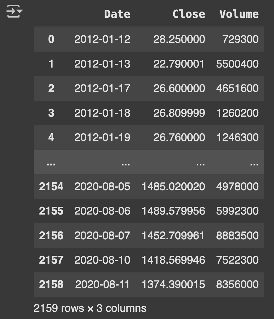
Data Preparation: Combined separate stock price and volume datasets using custom individual_stock() function. Created target variable using trading_window() function with 1-day prediction horizon. Focused on Tesla (TSLA) stock as the primary case study.
Feature Engineering & Preprocessing: Applied MinMaxScaler to normalize closing prices and volumes to (0,1) range. Converted 1D arrays to 3D format required for LSTM input (samples, timesteps, features). Split data with 75% for training and 25% for testing.
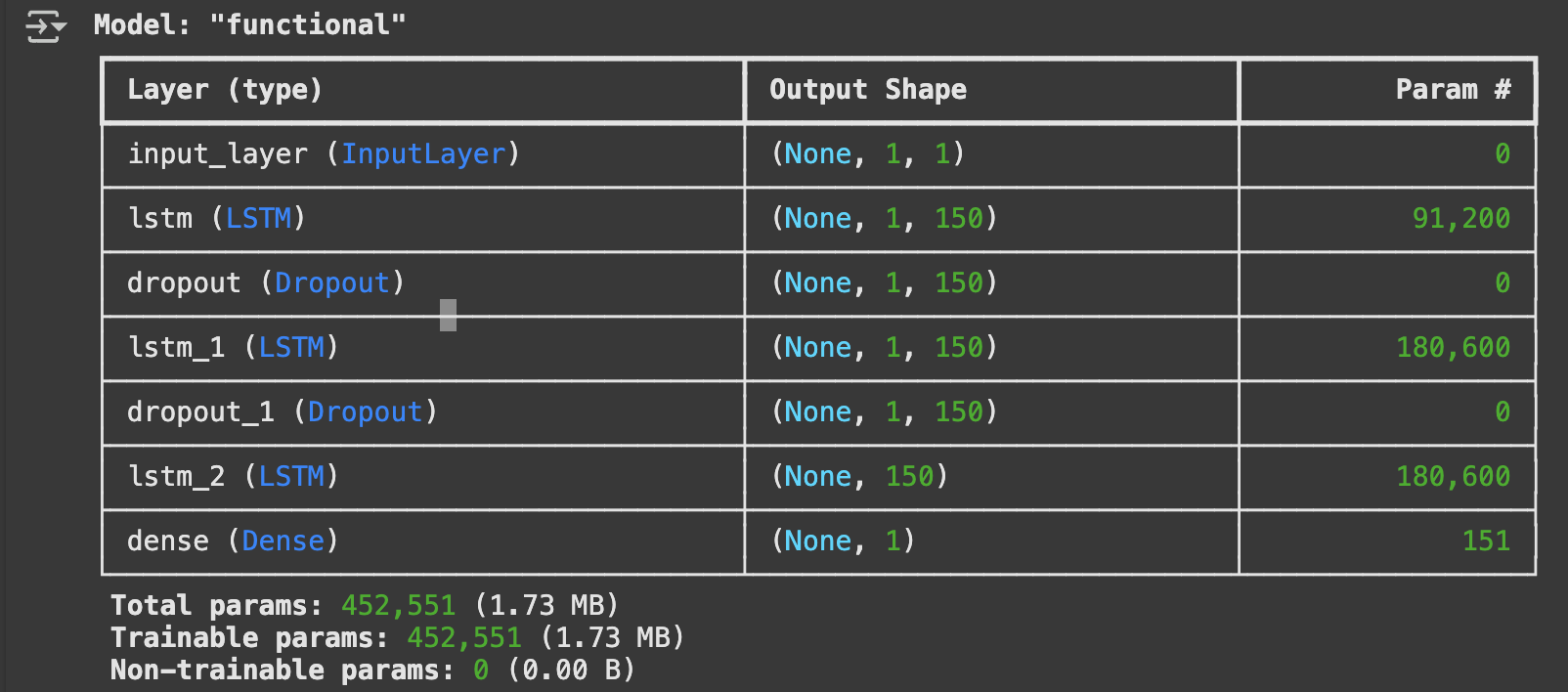
Model Architecture: Built multi-layer LSTM model with three LSTM layers (150 units each). Implemented dropout layers (0.3 rate) between LSTM layers to prevent overfitting, used linear activation for final dense layer to output continuous price predictions and compiled with Adam optimizer and MSE loss function.
Model Validation: Implemented 5-fold cross-validation to ensure model robustness, trained for 20 epochs with batch size of 32 and used 20% validation split during training for monitoring.
📊 Code Snippets & Visualisations:
# Importing the libraries
import pandas as pd
import plotly.express as px
from copy import copy
from scipy import stats
import matplotlib.pyplot as plt
import numpy as np
import plotly.figure_factory as ff
from sklearn.linear_model import LinearRegression
from sklearn.svm import SVR
from sklearn.model_selection import train_test_split
from sklearn.metrics import r2_score
from sklearn.preprocessing import MinMaxScaler
from sklearn.model_selection import KFold
from tensorflow import keras
# Prepare Data for training
# Function to concatenate the date, stock price, and volume in one dataframe
def individual_stock(price_df, vol_df, name):
return pd.DataFrame({
'Date': price_df['Date'],
'Close': price_df[name],
'Volume': vol_df[name]
})
# Function to return the output (target) data ML Model [Target stock price today will be tomorrow's price]
def trading_window(data):
n = 1 # 1 day window
# Create a column containing the prices for the next 1 days
data['Target'] = data[['Close']].shift(-n)
return data
# Test concatenation function using individual stock (Table 1)
price_volume_df = individual_stock(stock_price_df, stock_vol_df, 'TSLA')
print(price_volume_df)
# Train An LSTM Time Series Model
# Use the close and volume data as training data (Input)
training_data = price_volume_df.iloc[:, 1:3].values
print("Training data shape:", training_data.shape)
# Apply feature scaling the data
sc = MinMaxScaler(feature_range=(0, 1))
training_set_scaled = sc.fit_transform(training_data)
# Create the training and testing data, training data contains present day and previous day values
X = []
y = []
for i in range(1, len(price_volume_df)):
X.append(training_set_scaled[i-1:i, 0])
y.append(training_set_scaled[i, 0])
# Convert the data into array format
X = np.asarray(X)
y = np.asarray(y)
# Split the data
split = int(0.75 * len(X))
X_train = X[:split]
y_train = y[:split]
X_test = X[split:]
y_test = y[split:]
# Reshape the 1D arrays to 3D arrays to feed in the model
X_train = np.reshape(X_train, (X_train.shape[0], X_train.shape[1], 1))
X_test = np.reshape(X_test, (X_test.shape[0], X_test.shape[1], 1))
print("X_train shape:", X_train.shape, "X_test shape:", X_test.shape)
# Create the LSTM model
inputs = keras.layers.Input(shape=(X_train.shape[1], X_train.shape[2]))
x = keras.layers.LSTM(150, return_sequences=True)(inputs)
x = keras.layers.Dropout(0.3)(x)
x = keras.layers.LSTM(150, return_sequences=True)(x)
x = keras.layers.Dropout(0.3)(x)
x = keras.layers.LSTM(150)(x)
outputs = keras.layers.Dense(1, activation='linear')(x)
model = keras.Model(inputs=inputs, outputs=outputs)
model.compile(optimizer='adam', loss="mse")
model.summary()
# Train the model
history = model.fit(
X_train, y_train,
epochs=20,
batch_size=32,
validation_split=0.2
)
# Make predictions on test data
test_predicted = model.predict(X_test)
# K folds cross validation for model
# Define the number of folds
k = 5
kf = KFold(n_splits=k, shuffle=True, random_state=42)
# Initialize a list to store the validation loss for each fold
fold_losses = []
# Create a fresh model for cross-validation
def create_lstm_model(input_shape):
inputs = keras.layers.Input(shape=input_shape)
x = keras.layers.LSTM(150, return_sequences=True)(inputs)
x = keras.layers.Dropout(0.3)(x)
x = keras.layers.LSTM(150, return_sequences=True)(x)
x = keras.layers.Dropout(0.3)(x)
x = keras.layers.LSTM(150)(x)
outputs = keras.layers.Dense(1, activation='linear')(x)
model = keras.Model(inputs=inputs, outputs=outputs)
model.compile(optimizer='adam', loss="mse")
return model
# Perform k-fold cross validation
for fold, (train_index, val_index) in enumerate(kf.split(X)):
print(f"Training fold {fold + 1}/{k}")
X_train_fold, X_val_fold = X[train_index], X[val_index]
y_train_fold, y_val_fold = y[train_index], y[val_index]
# Reshape data for LSTM
X_train_fold = np.reshape(X_train_fold, (X_train_fold.shape[0], X_train_fold.shape[1], 1))
X_val_fold = np.reshape(X_val_fold, (X_val_fold.shape[0], X_val_fold.shape[1], 1))
# Create a new model for this fold
fold_model = create_lstm_model((X_train_fold.shape[1], X_train_fold.shape[2]))
# Train the model on the training fold
history = fold_model.fit(
X_train_fold, y_train_fold,
epochs=20,
batch_size=32,
validation_data=(X_val_fold, y_val_fold),
verbose=0 # Reduce output for cleaner logs
)
# Evaluate the model on the validation fold and store the loss
val_loss = fold_model.evaluate(X_val_fold, y_val_fold, verbose=0)
fold_losses.append(val_loss)
print(f"Fold {fold + 1} validation loss: {val_loss}")
# Calculate the average validation loss across all folds
average_val_loss = np.mean(fold_losses)
print("Average Validation Loss:", average_val_loss)
print("Standard deviation of validation losses:", np.std(fold_losses))
# Get the Closing price data for visualization
close = []
for i in training_set_scaled:
close.append(i[0])
# Create dataframe for the dates, predicted prices and closing price
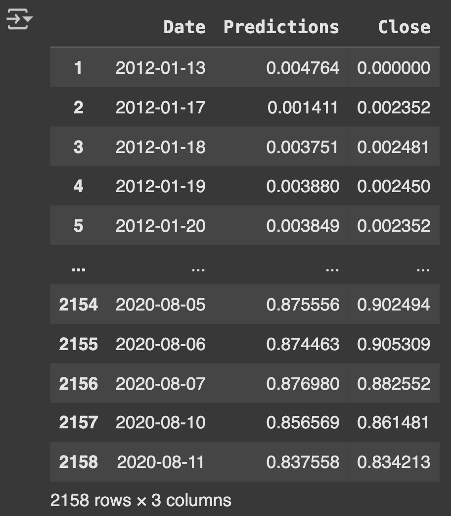
df_predicted = price_volume_df[1:][['Date']].copy()
# Ensure we have the right number of predictions
if len(test_predicted) < len(df_predicted):
# If we have fewer predictions, take the last part of the dataframe
df_predicted = df_predicted.tail(len(test_predicted)).copy()
df_predicted['Predictions'] = test_predicted.flatten()
df_predicted['Close'] = close[-len(test_predicted):]
else:
# If we have enough predictions, take the corresponding part
df_predicted['Predictions'] = test_predicted[:len(df_predicted)].flatten()
df_predicted['Close'] = close[1:len(df_predicted)+1]
print("Prediction dataframe:")
print(df_predicted.head())
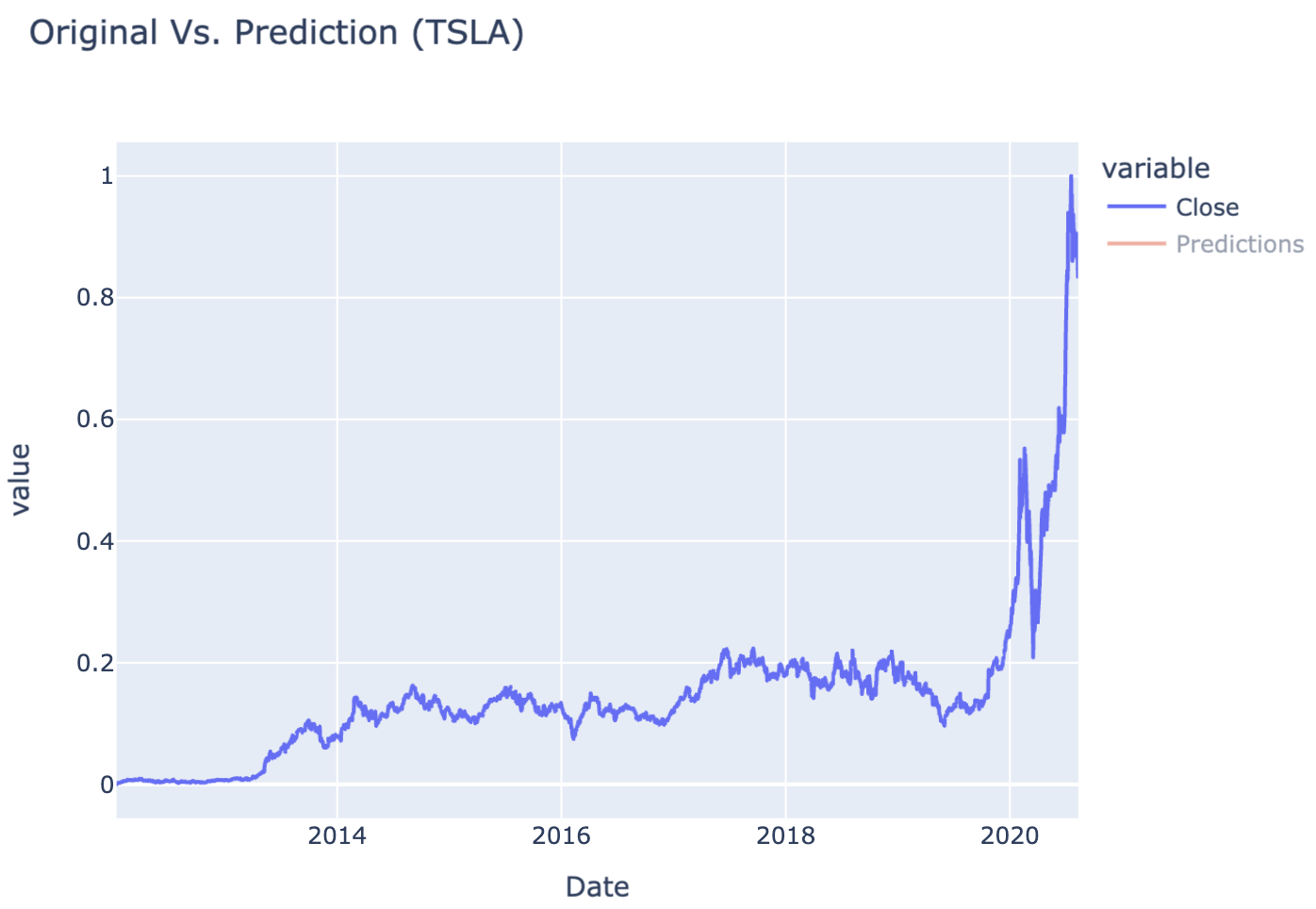
# Define interactive plot
def interactive_plot(df, title):
fig = px.line(df, title=title, x='Date', y=['Close', 'Predictions'])
fig.show()
# Plot the results (Figure 1 & 2)
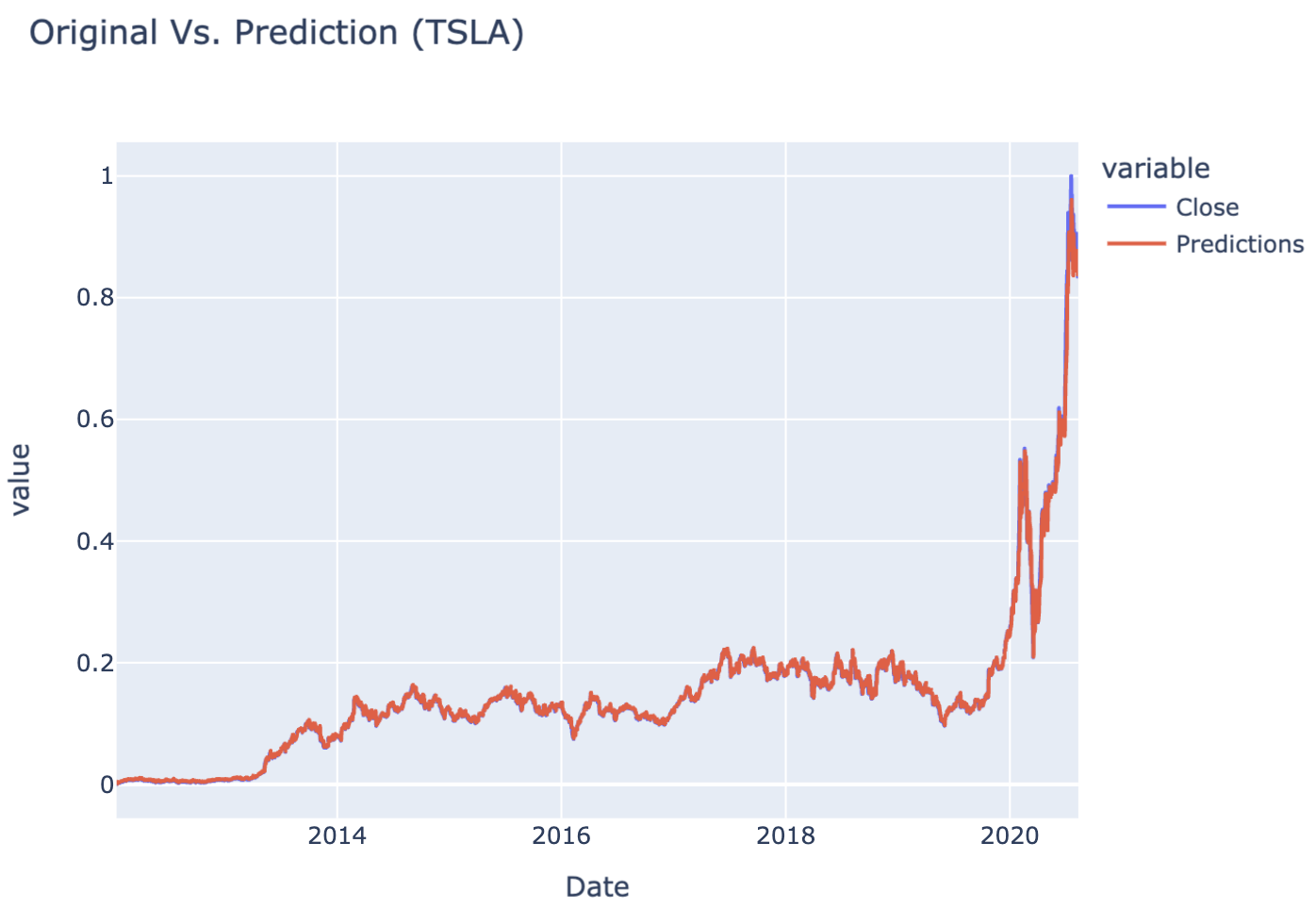
interactive_plot(df_predicted, "Original Vs. Prediction (TSLA)")
Table 1Table 2 LSTM Model ExecutionTable 3 Closing vs Prediction PriceFigure 1 Closing PriceFigure 2 Closing vs Prediction Price
🌟 Key Insights:
The model demonstrated strong performance in predicting stock prices, with an average validation loss indicating effective learning.
Release day (or time) significantly influenced stock price trends, reflecting market behavior that could be strategic or influenced by external factors.
Using LSTM allowed the model to capture temporal dependencies effectively, which might not have been possible with simpler models like linear regression.
K-fold cross-validation revealed consistent model performance across different time periods, suggesting the LSTM approach generalizes well to unseen Tesla stock data.
🧗🏾 Challenge Faced:
My biggest challenge was preparing the time series data in the correct 3D format for LSTM input. Initially, I struggled with reshaping arrays from 1D to the required (samples, timesteps, features) structure. After researching LSTM input requirements and experimenting with NumPy reshape operations, I learned to properly sequence the data with sliding windows and convert to the appropriate tensor dimensions for neural network training.
Customer Churn Prediction with ANN (Classification)
This project developed a binary classification model to predict bank customer churn using an Artificial Neural Network (ANN). I built a deep learning solution to identify customers likely to leave the bank based on their demographic and account information, enabling proactive retention strategies.
💻 Tech Stack:
Python for machine learning model development and comparison
Scikit-learn for preprocessing, encoding, scaling, and evaluation metrics
Pandas for dataset loading and initial data exploration
NumPy for numerical operations and grid generation
TensorFlow/Keras for building and training the neural network
🧪 Data Pipeline:
Load & inspect data: Loaded customer banking dataset with demographic and account features, selected relevant features (columns [:, 3:-1]) as input variables and extracted churn status as target binary variableloc[].
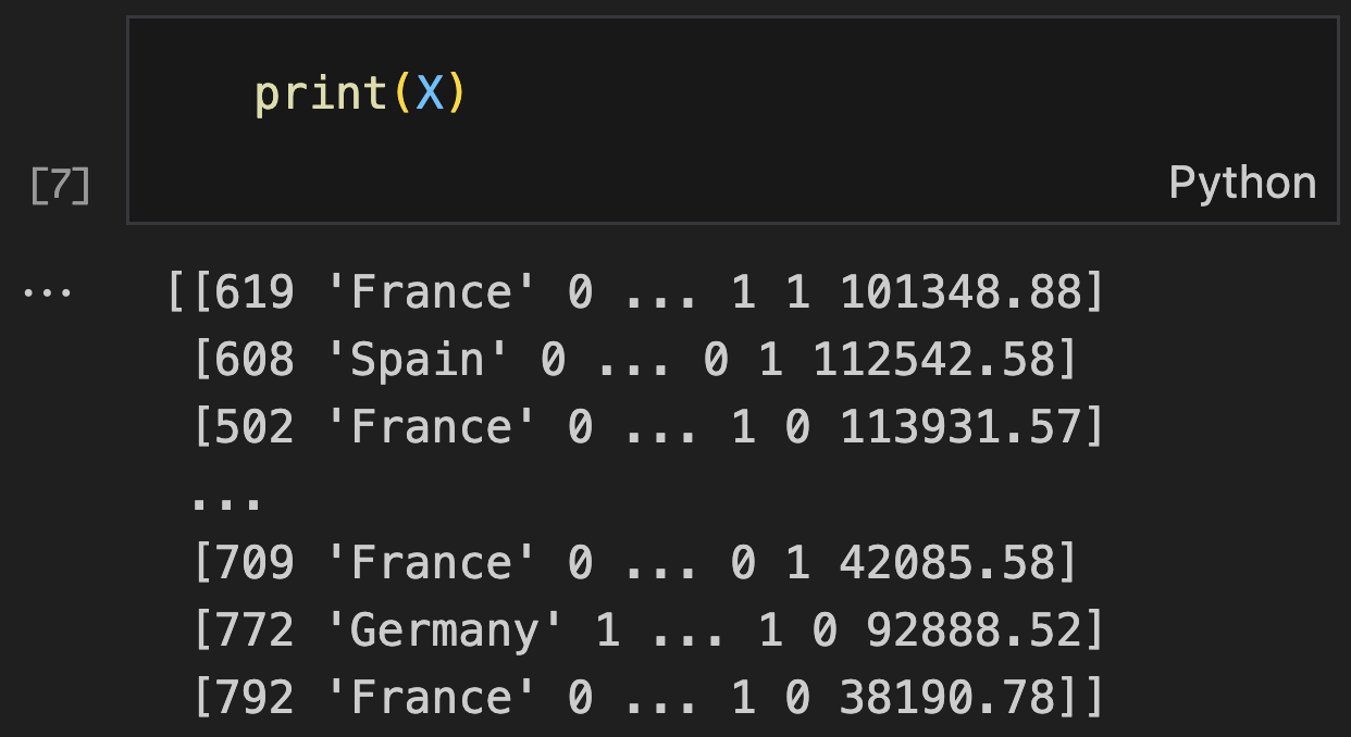
Data preprocessing Analysis: Applied Label Encoding to convert Gender column to numerical format, Implemented One-Hot Encoding for Geography column to handle multiple categories and used ColumnTransformer to apply different encodings to specific columns
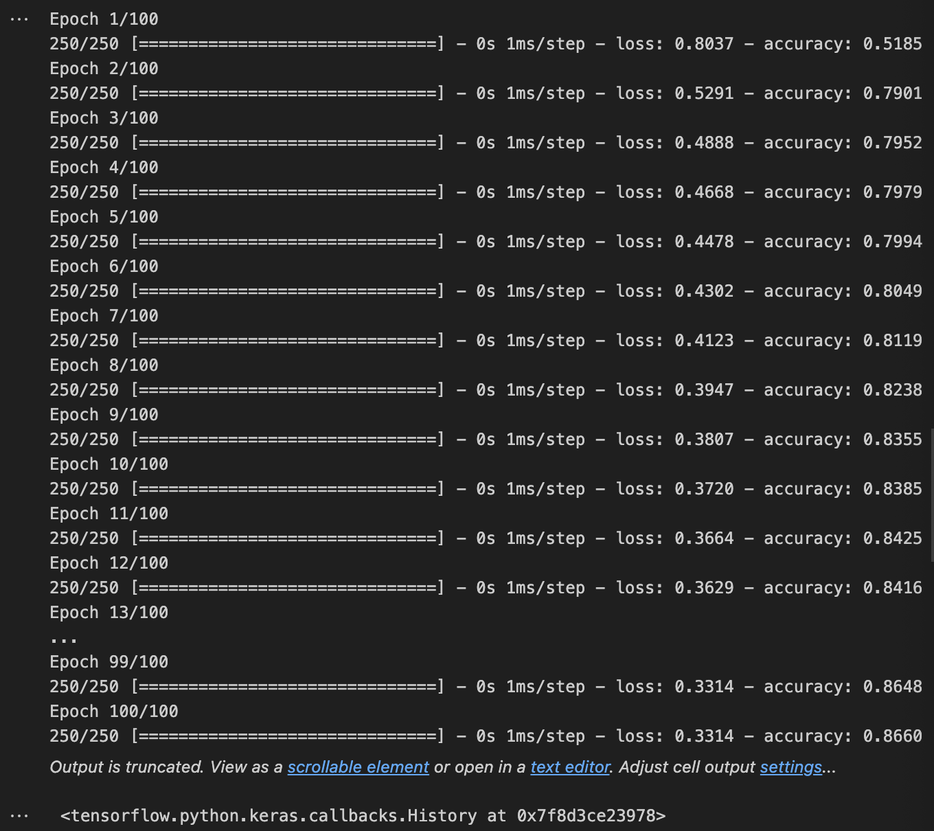
Model Architecture: Built Sequential ANN with three layers: two hidden layers (6 units each, ReLU activation) and output layer (1 unit, sigmoid activation), compiled with Adam optimizer and binary crossentropy loss for binary classification and trained for 100 epochs with batch size of 32
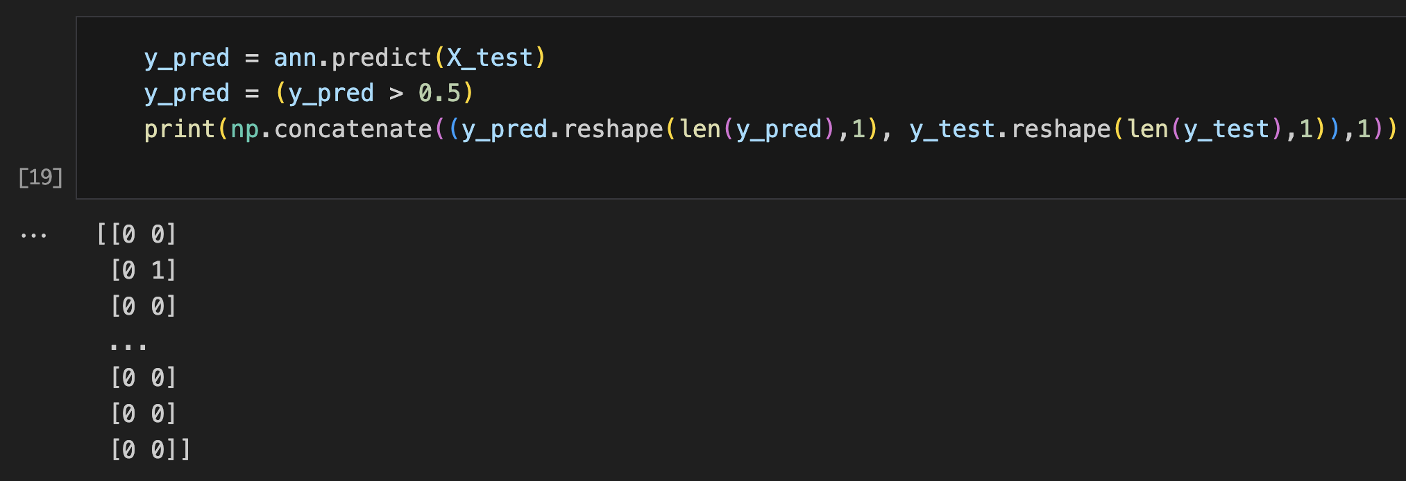
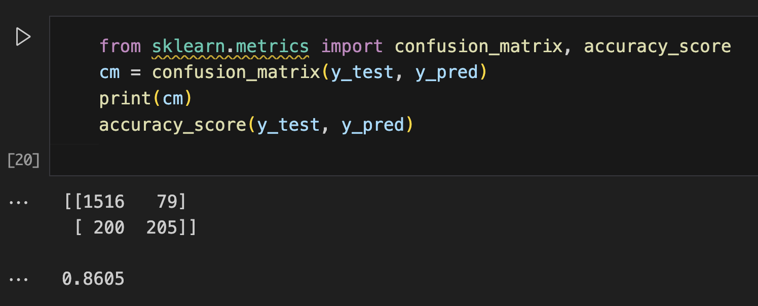
Model Evaluation: Generated predictions on test set with 0.5 probability threshold, created confusion matrix to analyze true/false positives and negatives and calculated accuracy score for overall model performance assessment
📊 Code Snippets & Visualisations:
# Importing the libraries
import numpy as np
import pandas as pd
import tensorflow as tf
from sklearn.preprocessing import LabelEncoder, StandardScaler, OneHotEncoder
from sklearn.compose import ColumnTransformer
from sklearn.model_selection import train_test_split
from sklearn.metrics import confusion_matrix, accuracy_score
# Import dataset
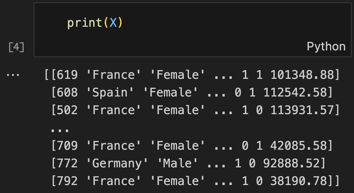
dataset = pd.read_csv('Churn_Modelling.csv')
X = dataset.iloc[:, 3:-1].values
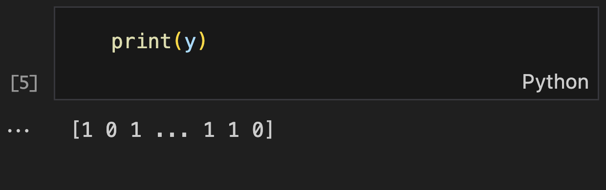
y = dataset.iloc[:, -1].values
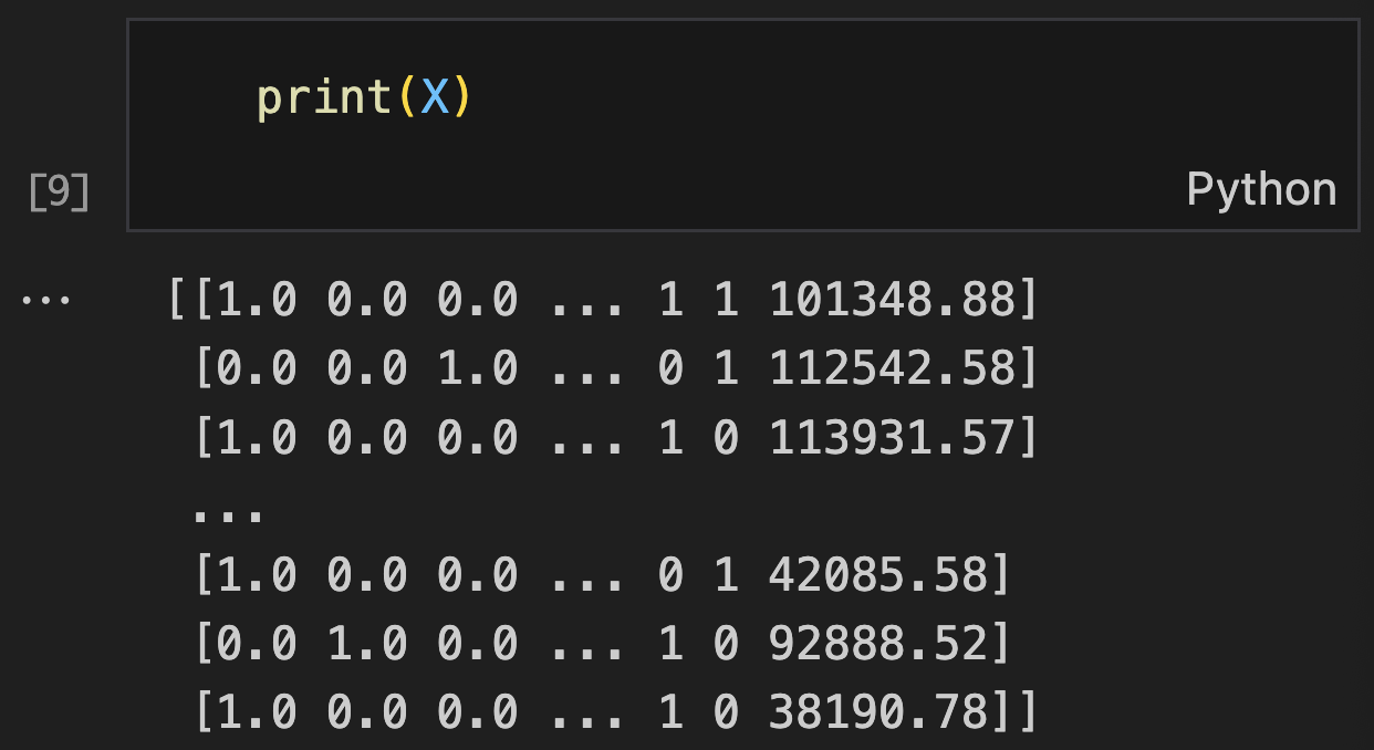
print("Features (X):") # Table 1
print(X)
print("\nTarget variable (y):") # Table 2
print(y)
# Encoding categorical data (encoding gender column) (Table 3)
le = LabelEncoder()
X[:, 2] = le.fit_transform(X[:, 2])
print("\nAfter Label Encoding Gender:") # Table 3
print(X)
# Encoding categorical data (One Hot encoding geography column) (Table 4)
ct = ColumnTransformer(transformers=[('encoder', OneHotEncoder(), [1])], remainder='passthrough')
X = np.array(ct.fit_transform(X))
print("\nAfter One-Hot Encoding Geography:") # Table 4
print(X)
# Splitting the dataset into Training and test set
X_train, X_test, y_train, y_test = train_test_split(X, y, test_size=0.2, random_state=0)
# Feature Scaling
sc = StandardScaler()
X_train = sc.fit_transform(X_train)
X_test = sc.transform(X_test)
# Building ANN
ann = tf.keras.models.Sequential()
ann.add(tf.keras.layers.Dense(units=6, activation='relu'))
ann.add(tf.keras.layers.Dense(units=6, activation='relu'))
ann.add(tf.keras.layers.Dense(units=1, activation='sigmoid'))
# Compiling the ANN
ann.compile(optimizer='adam', loss='binary_crossentropy', metrics=['accuracy'])
# Training ANN (Table 5)
history = ann.fit(X_train, y_train, batch_size=32, epochs=100)
# Display training results
print("\nTraining completed. Final accuracy:", history.history['accuracy'][-1])
# Predicting results of a single observation
# Note: The input should match the preprocessing (one-hot encoded geography + other features)
sample_prediction = ann.predict(sc.transform([[1, 0, 0, 600, 1, 40, 3, 60000, 2, 1, 1, 50000]]))
print("\nSingle prediction probability:", sample_prediction[0][0])
print("Single prediction (>0.5):", sample_prediction > 0.5)
# Predicting Test set results (Table 6)
y_pred = ann.predict(X_test)
y_pred_binary = (y_pred > 0.5)
print("\nPredictions vs Actual (first 20 samples):") # Table 6
comparison = np.concatenate((y_pred_binary.reshape(len(y_pred_binary), 1),
y_test.reshape(len(y_test), 1)), 1)
print("Predicted | Actual")
print(comparison[:20])
# Making the Confusion Matrix (Table 7)
cm = confusion_matrix(y_test, y_pred_binary)
accuracy = accuracy_score(y_test, y_pred_binary)
print("\nConfusion Matrix:") # Table 7
print(cm)
print(f"\nAccuracy Score: {accuracy:.4f}")
# Additional metrics for better evaluation
from sklearn.metrics import classification_report
print("\nClassification Report:")
print(classification_report(y_test, y_pred_binary))
# Model summary
print("\nModel Architecture:")
ann.summary()
Table 1 Variable XTable 2 Variable yTable 3 Encoding GenderTable 4 Encoding CountryTable 5 Training the ANNTable 6 Predicting Test Set ResultsTable 7 Confusion Matrix
🌟 Key Insights:
Neural networks effectively capture non-linear relationships between customer demographics and churn behavior, outperforming traditional linear models for this complex classification task
Feature engineering with proper encoding techniques significantly improved model performance, particularly the one-hot encoding of geography which revealed location-based churn patterns
Confusion matrix analysis revealed the trade-offs between sensitivity (detecting cancer) and specificity (avoiding false alarms)
Standardization was crucial for ANN convergence, as the varied scales of financial features (account balance, salary) required normalization to prevent training instability
🧗🏾 Challenge Faced:
The main challenge was handling mixed categorical and numerical data types efficiently. Initially, I struggled with applying different encoding methods to different columns simultaneously. After experimenting with various approaches, I discovered ColumnTransformer, which allowed me to apply One-Hot Encoding to geography while preserving other numerical features, streamlining the preprocessing pipeline significantly.
This project explores image classification using the FashionMNIST dataset, focusing on comparing CNN architectures to improve accuracy and training efficiency. It began as a practical extension of previous work in computer vision, driven by curiosity to deepen my understanding of how convolutional layers and activation functions impact learning. I designed a CNN inspired by the TinyVGG architecture and benchmarked it against two other models on performance and training time.
💻 Tech Stack:
Python for machine learning model development
PyTorch for deep learning and custom CNN architecture
Matplotlib for visualisation
TorchMetrics & MLXtend for evaluation and plotting confusion matrix
🧪 Data Pipeline:
Import & Setup: Loaded FashionMNIST using torchvision.datasets, transforming PIL images into PyTorch tensors.
Visual Exploration: Used matplotlib.pyplot to visualise images in grayscale and display class names, gaining familiarity with the data distribution (Figures A–C).
Data Loaders: Implemented DataLoader objects with shuffling and batching (batch size = 32) for both training and test datasets.
Model Definition: Constructed a CNN (TinyVGG-inspired) using nn.Sequential blocks for convolution, activation, and pooling, with a dynamically calculated flattened feature size for the final Linear layer.
Model Training: Trained the CNN using a loop with manual timing and CrossEntropyLoss. Tracked model accuracy with a custom accuracy_function.
Model Evaluation: Used a combination of random sample predictions, visual comparisons (Figure 3), and a confusion matrix (Figure 4) using TorchMetrics + MLXtend for deeper analysis.
📊 Code Snippets & Visualisations:
# Importing the libraries
import torch
from torch import nn

# Import torchvision
import torchvision

# Import matplotlib for visualization
import matplotlib.pyplot as plt

# Setup device Agnostic Code
device = "cuda" if torch.cuda.is_available() else "cpu"
print(f"Using Device: {device}")

# Setup training data
from torchvision import datasets
from torchvision.transforms import ToTensor

train_data = datasets.FashionMNIST(
    root="data",
    train=True,
    download=True,
    transform=ToTensor(),
    target_transform=None
)

# Setup testing data
test_data = datasets.FashionMNIST(
    root="data",
    train=False,
    download=True,
    transform=ToTensor(),
    target_transform=None
)

# Explore Data
len(train_data), len(test_data)

# See first training sample
image, label = train_data[0]
print(label)
print(image)

# See classes of data
class_names = train_data.classes
class_names

# Labels and their corresponding index
class_to_idx = train_data.class_to_idx
class_to_idx

# Check shape of our Image
image.shape, label
print(f"Image shape: {image.shape} -> [colour_channels, height, width]")
print(f"Image label: {class_names[label]}")

# Visualise data (Figure A)
image, label = train_data[0]
print(f"Image shape: {image.shape}")
plt.imshow(image.squeeze())
plt.title(label)

# Observe image in grayscale (Figure B)
plt.imshow(image.squeeze(), cmap="gray")
plt.title(class_names[label])
plt.axis(False)

# Plot more images (Figure C)
torch.manual_seed(42)
fig = plt.figure(figsize=(9, 9))
rows, cols = 4, 4
for i in range(1, rows * cols + 1):
    random_idx = torch.randint(0, len(train_data), size=[1]).item()
    img, label = train_data[random_idx]
    fig.add_subplot(rows, cols, i)
    plt.imshow(img.squeeze(), cmap="gray")
    plt.title(class_names[label])
    plt.axis(False)

# Prepare Dataloader
from torch.utils.data import DataLoader

# Setup the batch size hyperparameter
BATCH_SIZE = 32

# Turn datasets into iterables (batches)
train_dataloader = DataLoader(train_data, batch_size=BATCH_SIZE, shuffle=True)
test_dataloader = DataLoader(test_data, batch_size=BATCH_SIZE, shuffle=False)

# Check out created dataloader
print(f"Dataloaders: {train_dataloader, test_dataloader}")
print(f"Length of train dataloader: {len(train_dataloader)} batches of {BATCH_SIZE}")
print(f"Length of test dataloader: {len(test_dataloader)} batches of {BATCH_SIZE}")

# Check what's inside the training dataloader
train_features_batch, train_labels_batch = next(iter(train_dataloader))
train_features_batch.shape, train_labels_batch.shape

# Create a convolutional neural network
class ImageModelV2(nn.Module):
    """
    Model architecture copying TinyVGG from:
    https://poloclub.github.io/cnn-explainer/
    """
    def __init__(self, input_shape: int, hidden_units: int, output_shape: int):
        super().__init__()
        self.conv_block_1 = nn.Sequential(
            nn.Conv2d(in_channels=input_shape, out_channels=hidden_units, kernel_size=3, stride=1, padding=1),
            nn.ReLU(),
            nn.Conv2d(in_channels=hidden_units, out_channels=hidden_units, kernel_size=3, stride=1, padding=1),
            nn.ReLU(),
            nn.MaxPool2d(kernel_size=2, stride=2)
        )
        self.conv_block_2 = nn.Sequential(
            nn.Conv2d(in_channels=hidden_units, out_channels=hidden_units, kernel_size=3, stride=1, padding=1),
            nn.ReLU(),
            nn.Conv2d(in_channels=hidden_units, out_channels=hidden_units, kernel_size=3, stride=1, padding=1),
            nn.ReLU(),
            nn.MaxPool2d(kernel_size=2)
        )

        # Dynamically calculate flattened feature size
        with torch.no_grad():
            dummy_input = torch.randn(1, input_shape, 28, 28)
            x = self.conv_block_1(dummy_input)
            x = self.conv_block_2(x)
            self.flattened_size = x.view(1, -1).shape[1]

        self.classifier = nn.Sequential(
            nn.Flatten(),
            nn.Linear(in_features=self.flattened_size, out_features=output_shape)
        )

    def forward(self, x):
        x = self.conv_block_1(x)
        x = self.conv_block_2(x)
        x = self.classifier(x)
        return x

# Create instance of the model_2
torch.manual_seed(42)
model_2 = ImageModelV2(input_shape=1, hidden_units=10, output_shape=len(class_names)).to(device)

# Create loss function, optimizer and evaluation
def accuracy_function(y_true, y_pred):
    correct = torch.eq(y_true, y_pred).sum().item()
    acc = (correct / len(y_pred)) * 100
    return acc

loss_fn = nn.CrossEntropyLoss()
optimizer = torch.optim.SGD(params=model_2.parameters(), lr=0.1)

# Training & Testing CNN Model
from timeit import default_timer as timer
train_time_start_model_2 = timer()

# Train and test model (Figure 1)
from tqdm.auto import tqdm

epochs = 3
for epoch in tqdm(range(epochs)):
    print(f"Epoch: {epoch}\n---------")
    train_step(model=model_2,
               data_loader=train_dataloader,
               loss_fn=loss_fn,
               optimizer=optimizer,
               accuracy_fn=accuracy_function,
               device=device)

    test_step(model=model_2,
              data_loader=test_dataloader,
              loss_fn=loss_fn,
              accuracy_fn=accuracy_function,
              device=device)

train_time_end_model_2 = timer()
total_train_time_model_2 = print_train_time(start=train_time_start_model_2,
                                            end=train_time_end_model_2,
                                            device=device)

# Get model_2 results
model_2_results = eval_model(
    model=model_2,
    data_loader=test_dataloader,
    loss_fn=loss_fn,
    accuracy_fn=accuracy_function
)

# Create dataframe to view results of Models
import pandas as pd

compare_results = pd.DataFrame([
    model_0_results,
    model_1_results,
    model_2_results
])

compare_results["training_time"] = [
    total_train_time_model_0,
    total_train_time_model_1,
    total_train_time_model_2
]

# Visualise Model Results (Figure 2)
compare_results.set_index("model_name")["model_acc"].plot(kind="barh")
plt.xlabel("Accuracy(%)")
plt.ylabel("Model Name")
plt.title("Model Accuracy Comparison")

# Make and Evaluate Random Predictions
def make_predictions(model: torch.nn.Module, data: list, device: torch.device = device):
    pred_probs = []
    model.eval()
    with torch.inference_mode():
        for sample in data:
            sample = torch.unsqueeze(sample, dim=0).to(device)
            pred_logit = model(sample)
            pred_prob = torch.softmax(pred_logit.squeeze(), dim=0)
            pred_probs.append(pred_prob.cpu())
    return torch.stack(pred_probs)

import random
random.seed(51)
test_samples = []
test_labels = []

for sample, label in random.sample(list(test_data), k=9):
    test_samples.append(sample)
    test_labels.append(label)

# Make Predictions
pred_probs = make_predictions(model=model_2, data=test_samples)
pred_classes = pred_probs.argmax(dim=1)

# Plot predictions (Figure 2)
plt.figure(figsize=(9, 9))
nrows, ncols = 3, 3
for i, sample in enumerate(test_samples):
    plt.subplot(nrows, ncols, i + 1)
    plt.imshow(sample.squeeze(), cmap="gray")
    pred_label = class_names[pred_classes[i]]
    truth_label = class_names[test_labels[i]]
    title_text = f"Pred: {pred_label} | Truth: {truth_label}"
    plt.title(title_text, fontsize=10, c="g" if pred_label == truth_label else "r")
    plt.axis(False)

# Making Confusion Matrix (Figure 3)
y_preds = []
model_2.eval()
with torch.inference_mode():
    for X, y in tqdm(test_dataloader, desc="Making predictions"):
        X, y = X.to(device), y.to(device)
        y_logit = model_2(X)
        y_pred = torch.softmax(y_logit, dim=1).argmax(dim=1)
        y_preds.append(y_pred.cpu())

y_pred_tensor = torch.cat(y_preds)

# pip install dependencies
!pip install -q torchmetrics -U mlxtend

import torchmetrics
import mlxtend
print(f"mlxtend version: {mlxtend.__version__}")

from torchmetrics import ConfusionMatrix
from mlxtend.plotting import plot_confusion_matrix

confmat = ConfusionMatrix(num_classes=len(class_names), task='multiclass')
confmat_tensor = confmat(preds=y_pred_tensor, target=test_data.targets)

fig, ax = plot_confusion_matrix(
    conf_mat=confmat_tensor.numpy(),
    class_names=class_names,
    figsize=(10, 7)
)
Figure A EDA - Image (Colour)Figure B EDA - Image (Grayscale)Figure C EDA - Range of Images (Grayscale)Figure 1 Training & Testing ModelTable 2 Comparison of Different Model PerformanceFigure 2 Bar Chart of Model PerfomanceFigure 3 CNN Image PredictionFigure 4 Confusion Matrix
🌟 Key Insights:
The custom TinyVGG-style model performed significantly better in terms of accuracy than simpler baselines, demonstrating the importance of deeper architecture in capturing spatial hierarchies.
A higher-resolution grid (0.01 step size) in the visualisation allowed finer decision boundary analysis.
The confusion matrix revealed that similar-looking classes (e.g., shirts vs. T-shirts) were more prone to misclassification, informing ideas for future data augmentation or attention layers.
🧗🏾 Challenge Faced:
A key challenge was dynamically computing the flattened input size after the convolutional layers to correctly set up the first Linear layer. To solve this, I used a with torch.no_grad() block to pass dummy input through the conv layers and automatically extract the output shape. This approach prevented manual miscalculation and made the model reusable for different input sizes.
I am an aspiring data scientist and educator focused on curriculum innovation, AI-driven assessment, and machine learning for real-world educational impact. I attained my BSc in Liberal Arts & Sciences from Maastricht University, where I learned to blend critical thinking with interdisciplinary research—developing a mindset for tackling complex, real-world challenges.
At the University of Manchester, I took a deep dive into molecular biology research through an MRes in Tissue Engineering for Regenerative Medicine. There, I developed a gene therapy model for a genetic muscle-wasting disease, which acted as a proof-of-principle to support early stage clinical trials. During this time I strengthened my hypothesis-driven problem solving approach and my ability to leverage data to tell stories at the intersection of biomedical engineering and data analysis.
As a former science coordinator in the UAE public education system, I designed national exams, and later began integrating generative AI tools into the classroom. These experiences sparked my current focus of understanding data to help build AI systems that empower how people learn—ethically, adaptively, and with lasting impact.